Tuesday, May 31, 2011

CND Sapphire Sparkles on Black

CND Sapphire Sparkles over OPI Black Onyx

Yes, I said I'd swatch it and here it is! Amazing looking. I think this is better than OPI Ink, actually, because the glitter is chunkier, and it has a duochrome! Plus, in terms of shade, it's no different from OPI Ink. Even though Black Onyx is as black a polish as you can find, but CND still manages to transform it into an amazingly deep purple polish.

It's absolutely beautiful. I have no more words of admiration except for another picture:

CND Sapphire Sparkles over OPI Black Onyx

China Glaze White Cap on Black

China Glaze White Cap over OPI Black Onyx

China Glaze White Cap is from the Anchors Away collection '11.

This is 1 coat of China Glaze White Cap over Black Onyx. One may think that White Cap is a cheaper alternative to CND Jade Sparkles. Although I don't own Jade Sparkles, but having seen the quality of CND Sparkles in their Sapphire one, I am convinced that White Cap will never really substitute Jade Sparkles.

White Cap is a cream jelly base with fine golden shimmer in it. You can see how the cream translucent base plus the golden shimmer transform the black polish into something olive-golden. I personally am not digging the olive-golden shade, I think it could be achieved in better quality with Jade Sparkles over Black.

However, that's not to say that White Cap isn't a great polish! I've used it over other nail polishes to great effect. However, because of its translucent cream base, it may not turn out the way you think it would because it does make the base colour lighter and more faded-looking.

China Glaze Fairy Dust over Black

China Glaze Fairy Dust (1 coat) over OPI Black Onyx

China Glaze Fairy Dust (1 coat) over OPI Black Onyx

Good grief, just how dense is this? I'm so amazed by it already in just one coat! This has got to be the best holographic sparkle polish out there. Not only is it dense and even, the glitter in it is so beautifully holographic, I can't stop staring at it. Looks best over black because then you wouldn't have anything competing with Fairy Dust for epicosity.

I think I've mentioned it on another entry before but I love how Fairy Dust doesn't seem to just sit on the base colour, but it somehow feels as if it's suspended in the clear jelly base it's in, giving it this amazing depth that I've never seen done in any other layering glitter topcoat! The only bad thing about Fairy Dust is that it's so epic on its own that I never really feel like layering it over any coloured cremes because it doesn't quite do the glitters justice!

Also, unlike most other shimmery topcoats which enhance its base colour or makes the base colour different-looking, Fairy Dust doesn't. It's suspended in a clear base, so it wouldn't alter the shade or colour of your original polish, but because it's purely holographic, it's not any shade of colour at all (for example, I wouldn't call it a silvery glitter, because you see nothing but holographic specks), so it doesn't quite enhance the base.

If you want to go really crazy, go ahead and test how far you can resemble a disco ball by painting 2. However, I found that a 3rd coat didn't glitterify it significantly more than the 2nd coat.

China Glaze Fairy Dust (2 coats) over OPI Black Onyx

China Glaze Fairy Dust (2 coats) over OPI Black Onyx

OPI Black Onyx

OPI Black Onyx

I wasn't intending to do a review on this one, because I'm like, black is just a basic layering colour, right? Anyway, I bought this black polish purely for layering and experimenting purposes because I think I would never wear a black polish on its own like so without any kind of shimmer on it. Partially because my mom hates it.

But I'm so impressed by this one! Although it's a two-coater and therefore not exactly the most ideal for Konading but look at how glossy it is! And this is without topcoat!! Dry time on this was pretty good too! The time it took for me to take a few photos and type out most of this entry, it's already dry! Good if you intend to use it as a base for something.

Well, there's nothing much else to say besides that. It's black, it's creme and it's high freakin' gloss. Done!

Daiso Pearl Heart

Daiso Pearl Heart (1 coat)
1 coat.

Daiso Pearl Heart (3 coats)
5 coats.

Note: This polish doesn't have a name, so I called it Pearl Heart.

This is a sheer polish in a white base, with a green flash. I'm not exactly sure whether it's buildable or not, but here it is with 5 coats. If you do decide to wear this as a sheer, the creamy base will make your nail bed look pinkier and the green flash may also distract attention, if your nails are yellowish. It's a very peek-a-boo effect at 5 coats. At some angles, it looks more opaque white, from other angles, all you can see is the bright green flash, and at other angles still, you can see your nailbed and nail line very clearly.

Daiso is a Japanese chain of stores. I'm not exactly sure what to call it, because it sells everything from paper cutters to kitchen sponges to laptop cases and to the containers in which I store my nail polish. And yeap, they do have nail polishes too. The label's all in Japanese so I can't really read it. The best thing about this awesome place is that everything, every item in it is a standard fixed price of S$2. Including this nail polish, of course.

My experience with the nail polishes in Daiso is that - it's actually not bad quality for something so cheap! Quite value for money, though I've never actually bought any of their solid colours or chunky glitters. Only their layering microshimmers like this one, and two others, I have. Nothing to complain about, perhaps I shall layer this over Black Onyx and see how it turns out!

OPI Meet Me On The Star Ferry

OPI Meet Me On The Star Ferry


From the OPI Hong Kong collection '10.

You know, I'm not even sure why I bought this polish. It's far from the sort of colours I usually go for. MMOTSF is a sort of a very dark rust colour with purple and red undertones. It's a very interesting colour and it does remind me of Chinese restaurants somehow, in both its shade as well as the type of glitter in it. It has a very shimmery base which is semi-frosty, and in it, you have very fine glitter that flashes red and green, somewhat similar to the ones found in OPI Happy Anniversary, but finer. I cannot think of anything remotely in my collection that could compare to the colour, except maybe DS Diamond, but that's a holo and that's significantly lighter, although it's in the same range of colour.

Application was great, 2 coats only though I had to keep messing it up. I absolutely hate it when some edge or corner ambushes my unsuspecting fingers and it scrapes off a chunk of the wet polish. Can't get more annoying than that. Anyway, there's something about the shimmery base in this polish that makes the brushstrokes very obvious, so beware! It dries to a shiny enough finish, though it could do with a layer of topcoat, of course.

All in all, I'm not really sure whether I'd ever wear it, because the colour just doesn't quite excite me. It's not really purple, and it's not really red or bronze or brown. It's an interesting mix of all, and there's a slight mutedness to it which some might like, but I just can't really imagine myself in the mood to wear such a colour. That could explain why I never properly swatched it though I got it more than a few months ago! I've never even worn it out, never used it as a base for nail art - nothing.

Oh wells. At least I own something from one of the very few OPI collections that's actually Oriental-themed.

Sunday, May 29, 2011

Duping OPI Ink

i could really use a wish right now

i could really use a wish right now deux

Index: OPI Ink (2 coats)

Middle: OPI Black Onyx (2 coats), CND Sapphire Sparkles (2 coats)

Ring: OPI Black Onyx (2 coats), Daiso Blue Glitter (3 Coats)

Pinkie: OPI Ink (2 coats)

You know what. I actually prefer my middle finger combination over the original OPI Ink. I should never have underestimated the epic-ness of CND Sapphire Sparkles. Look at that amazing glitter! When it shines purple (which is, by the way, the exact same shade of purple in OPI Ink), it's of a very slightly larger glitter than that in Ink, and it's helluva lot more bling. The good thing about CND Sapphire Sparkles is that it also flashes blue at another angle, because it's a duochrome glitter and because it's awesome like that.

OPI Black Onyx + CND Sapphire Sparkles is definitely something like a value-added OPI Ink. I foresee myself wearing this way more often in the future. On a side note, I finally got a really good coverage of OPI Black Onyx for the first time. Previously, it's always seemed rather watery and obstinate, like I needed a few coats before it really showed the black, but this was just 2 and it came out very glossy and solid. Of course, you need to wait for a while before you can layer on the CND Sapphire Sparkles.

As for the Daiso one, the sparkles is definitely more sparse than the CND (duh, Daiso was only S$2!). Unlike Sapphire Sparkles which shines a mixture of purple and blue, Daiso flashes blue most of the time. Only at some angles can you see a hint of purple in those sparkles. Also, the blackness of the base still comes through strongly, so from afar, you're more likely to see black rather than a dark purple, as is the case for OPI Ink and CND. However, if you're one that loves black or very dark polish, and like the blue sparkles in this one, then go for it. Though more sparse than CND, the sparkliness can definitely compare.

I'm not sure if this was a fair comparison, seeing as OPI Ink was meant to be a microshimmer whereas CND and Daiso are almost foil-like glitters, but I'm glad I found the CND Sapphire Sparkles combination! Maybe I'll do a full swatch with it soon! (:

Friday, May 27, 2011

OPI Give Me The Moon (update!)

OPI Give Me The Moon

For my weekend manicure this week, despite trying out all my Konads and stuff, I decided to give this one a run. Because I was simply too lazy/tired to go Konads on all ten fingers so I opted for something safe and solid. I recently reviewed this one here. As usual, it took so many coats that I stopped counting but I'd just like to add...

IT'S FRIKKIN GORGEOUS?!

Yeah, I guess wearing it on 4 fingers for like 5 minutes was just enough to impress me on the femininity and elegance of this polish but actually wearing it on 10 fingers - I actually could not stop staring at it throughout my shower and I still can't stop staring it.

It's a dove grey base, something like Zoya Dove or China Glaze Pelican Grey, and they sprinkled some icy cool blue shimmer in it. But maybe because you can't reach full opacity so the pinkness of your own flesh shines through, but whatever the case, in dim lighting it looks like a mad awesome shade of shimmery lavender-pink. What?! Yeah, I don't get it either. Whatever the case, the colour of this polish is WINNING. XD

I said in my previous review that at some angles it might look grey. I retract that. I only see the grey as a base colour to the blue shimmer. It is impossible to see this polish as pure grey, near, far, wherever you are. My mum thought it was a purple. GOSH I LOVE IT. Hahaha. When it comes to nail polish, I'm a bit of a schizo. On one hand I like all these mad loud ones like Zoya Charla or Color Club Untamed Luxury, but on the other hand I'm as crazy over the super soft and subtle polishes like this one, or OPI Who Needs A Prince? There's something about the subtlety that wins me.

My first attempt at Konad!!

Konad m51, m79, m60

Whoots, here it is! OK, I lied, this isn't my first attempt at Konad, but it's the first ever documented!

Index
Base: China Glaze Snow
Stamp: Zoya Breezi
Plate: m51

I definitely like the index finger design best. It reminds me of old Chinese white porcelain cutlery with their intricate blue designs. But sorry for the smudge. Although the polish looks a little thin on the nail and looks a bit bald in some places, I actually like it that way! Like I said, reminds me of the Chinese cutlery.


Middle
Base: OPI Diva of Geneva
Stamp: Zoya Marley
Plate: m79

Middle finger looks a bit strange! I don't think the combination goes really well. For a relatively darker polish like Diva of Geneva, a lighter stamping colour would be better. Zoya Marley was supposed to be that light shade, but for some reason it came out pretty dark on the nail. The design's a little incomplete but I also surprisingly like it that way. Gives it a bit of a vintage feel, especially since the design is roses and pearls and random lines.

Ring
Base: Zoya Marley
Stamp: OPI DS Diamond
Plate: m60

UGH, I can't see DS Diamond at all! What a pity. I had expected DS Diamond to really shine when on Marley but, no. I can't see it at all. And because it's a scattered holo, I suspect that's why the holo effect didn't come out so well when stamped on, unlike linear holos (like legendary China Glaze OMG etc.) How saddening. Now it just looks like I have some glittery holo topcoat-ish thing on my Marley.

Pinkie
Base: OPI The One That Got Away
Stamp: Konad Special White Polish
Plate: m51

Whoops, I forgot to put on a topcoat for this one. And before anyone comes up to me with an accusation of not cleaning up properly on my pinkie, the story goes that when I stamped it on, I was so amused by that whole bit that stuck out (and rather enamoured by the design) that I kept it as it is. But yes, I will clean it up later on. I like the combination here. The One That Got Away is one of my favourite base colours of just about any nail art because it's that deep but rich shade of reddish-pink, but the glass flecks in it really helps it become bright. So basically it's good for just about everything.

Hailing from Korea, Konad is a brand that specializes in making image plates on which you can paint on nail polish, scrape it off (so that there's only nail polish left in the engravings of the design), stamp it on a stamper, and then stamp it on your nails. It sounds difficult, but it's actually pretty easy once you get the hang of it. Of course, doing it on your right hand (if you're right-handed) is a whole different ball game and one at which I am completely at the bottom of the ladder.

Anyhow, Konad (obviously) recommends you to get their own Konad special polish which is ultra-opaque (so much so that it is highly recommended that you do NOT try painting it as a full coat on your nails - honestly, I don't even want to try) as well as a whole bunch of other stuff. I like how small and handy all the equipment are, very convenient and all-round cute. Everything's a becoming girly shade of pink (hey, if you're doing nail art with flowers and stuff - kinda speaks volumes about you). Using the Konad special nail polish would definitely make it a lot easier for you to get the hang of things, and I would highly recommend that to beginners. Personally, I think the white Konad polish is a must-have for everyone, since white Konad is especially lovely. Black and silver are also becoming tempting. I stupidly bought the lavender shade which I have not used until now.

In my opinion, Konad's one of the easiest nail arts that I've come across. I've tried water marbling, I've tried nail foils and nothing really works without hair-pulling frustration. Shatter polish doesn't count. Konad, however, is pretty simple, as long as you don't do it in a windy place or under a fan, because the nail polish would dry up faster than you can stamp it. Yes, I confess, I learnt that the hard way. Anyway, that being said, Konad isn't fail proof (especially the RIGHT HAND), so you may have to practise a bit before you get things right.

So I'm really happy that I've found colours that are able to work with my Konad. This is my first time successfully trying stamping with non-Konad polishes! Generally, if you want to find something that works, go for those polishes that are one-coaters, or at least has a pretty good coverage in one coats. The thicker and creamier, the better. Zoya cremes work marvelously for this one, I've heard that China Glaze Millenium, 2030 and Color Club Worth The Risque and Revvvolution are great polishes for Konading as well. Will try it out when I get them!

Thursday, May 26, 2011

My shopping list for 8ty8beauty spree

I'm so excited, omgoodness!! Here's my shopping list for a recent 8ty8beauty spree that my friend's conducting. I hope that it should take less than 3 weeks to get here! :D

• OPI Houston, We Have A Purple from the Texas collection '11 (purple jelly)
• Color Club Worth The Risque (silver holo)
• Color Club Revvvolution (dark grey holo)
• Color Club Raspberry Rush from the Wicked Sweet collection (neon magenta with a candy scent)
• Color Club Electro Candy from the Electro Candy collection (neon bubblegum pink)
• Color Club Ultra Violet from the Electro Candy collection (neon purple with a blue duochrome)
• China Glaze Black Mesh from the Crackle Glaze collection (black shatter)

HOW COULD I NOT BE EXCITED?

In other news, I did a count of my nail polish collection and was shocked. I would rather not report the number here. It's a rather disturbing number to have collected, seeing as my nail polish fetish started only less than a year ago. ): I wonder how much money has gone down the drain.

Wednesday, May 25, 2011

OPI Give Me The Moon, OPI Ink

I was picking through a local nail polish online store's sales list and the two that I picked happened to be from the same collection, and I didn't even know till now. I got OPI Give Me The Moon and OPI Ink, both from the OPI Night Brights collection '07. 2007 was a looong time ago, back when I still shunned nail polish (the horror).

OPI Give Me The Moon
OPI Give Me The Moon. 5 coats. No topcoat.

This is a rather hard colour to describe, but it's a sort of gray base with yellow undertones, with an icy light blue shimmer. The colour is definitely unique, I haven't yet come across any nail polish that has that sort of colour yet. The shimmer isn't at all phantom, either. From afar, it lends a blue tinge to the grey, and only in very dim lightings or at certain angles would you not be able to discern any blue at all.

I like the colour very much but the only problem I have about this polish is the formula and thus, the application. The polish is rather sheer - I'm not sure if it was meant to be layered, or worn on its own but since all the other swatches I've seen of it, it's usually worn on its own, I'm going to assume that it's meant to stand by itself. It took me a whopping 5 COATS to get the opacity you see in this picture. If you squint, you can still see my VNL. That's a crazy long time! Sigh, but well, I'd definitely still wear this because I adore the colour and how special it is, I just have to make sure I have a movie to watch while waiting for all 5 coats to dry.

Update here!

OPI Ink
OPI Ink. 2 coats. With topcoat.

Homg.

HOOMMMGGG.

This is like nail polish orgasm. XD Sorry, but when I first painted it on my nails, I was like, whimper! It deserved another shot on the cam.

OPI Ink

You know, I like this polish so much that it's still on just 4 of my fingers, after swatching them? I haven't yet rubbed them off because I really really like it. And trust me, I'm someone who shuns from dark, or black-based polish, so that is saying a lot to the attractive quality of OPI Ink.

I've long heard of the legendary OPI Ink but had never felt the need to own it, again because I shun dark or black-based polish. Only after I saw the beauty of Zoya Valerie in its bottle (unfortunately, I wasn't the one who bought it), and then seeing OPI Ink in its bottle as well at a school fair, I decided to get my hands on it.

OPI Ink has a black polish base, but it's so mad full of a purple/blue-flashing duochrome glitter, that it almost always looks like a rich, dark, royal purple. Again, only in the dimmest of lightings or at certain angles would it even come across as black. However, there is no denying that it's dark but the glitter is just so beautiful! I really, really love it! I cannot express how much I love it except - HOMG.

I was also surprised that this went on in like 2 easy coats because Give Me The Moon, from the same collection, had such a thin and tedious application. However, all the better for OPI Ink, I say! It's absolutely gorgeous and obviously, highly recommended for all, even those who usually don't like to wear dark-based polishes like me. (:

Monday, May 23, 2011

OPI Diva of Geneva

OPI Diva of Geneva

From the Swiss collection '10.

Now, before you guys think I'm so outdated and all that, this is one of my first few nail polishes ever and I have to say, I haven't seen many duochromes pass through my hands that can surpass the richness of this one. Diva of Geneva is a rich, cool purple with very obvious red maroon undertones, and is chock full of a gold glitter. The gold glitter is most obvious in the bottle, and doesn't quite translate into much of a duochrome effect but it makes its presence felt by contributing to the shimmery appearance of the polish.

This one is a classic. In flourescent, white lighting, it shows in the usual purple tones, but in dim, yellow lighthing, it looks like a rich, vixeny maroon. It's often hard for even me to discern if it looks more purple or red. I often get confuzzled myself! One of my favourite nail polishes. It dries semi-matte but has a really good coverage. This was only 2 coats.

Sephora 0272A with Silver Shatter

If you remember this little post with my Sephora mini-haul, you would probably know I'm head over heels in love with Sephora 0272A (gosh I hate the "name"). So naturally, I wondered how it'd look with the bling of Silver Shatter crowned over it.

It's the most fantastic creation I've made so far! (except for the one time I did Konad)

Sephora 0272a with Silver Shatter

GOOD GRIEF! Can you see the blue-green luminescence peeking through the glittery goodness of the Silver Shatter? It was absolutely fantastic, and it looked even better when I put on the topcoat layer, but it didn't look much different on photos, so I chose not to re-upload.

In most lightings, this turned out more glowy green than actually blue-green, but it didn't matter. My piano teacher liked it so much and we both thought it looked like Teenage Ninja Mutant Turtles, somehow. I really like how unique this combination is! It's like the Sephora might have been too bright on its own, so the Silver Shatter helps to tone that down a little, but because it's so glittery, it doesn't make it seem any duller either.

I also really liked how Silver Shatter cracked on this one! You can definitely see the plate-like formations (Geography, anyone?) The only thing to look out for is that with one layer of Seche Vite, the texture of your nail would feel a little bumpy because the Seche Vite seems to sink into the cracks of the Shatter. It's a pretty interesting effect. You can put on another layer of Seche Vite if it bothers you, but as it's only my weekend manicure, I didn't bother.

HIGHLY RECOMMENDED!

Zoya Kieko (+ Silver Shatter)

Zoya Kieko

From the Zoya summer '11 collection. Again, forgot what it was called. I've no idea why Zoya has such forgettable collection names. I tend to just think of them as an entire big Zoya collection, with new additions every so often.

Zoya Kieko is a warm purple with red undertones. It's really easy to mistake this for Mira, which is another purple released in the same collection. I don't own Mira but I've seen it in action and it has a definite blue undertone to it, as compared to Kieko. On its own, however, the two might be a bit difficult to differentiate. Anyway, as with all Zoya cremes, application was a dream. This was only 1 coat. And look at how glossy and shiny it is! High-gloss finish. You may cap the Seche Vite to use another day.

Zoya Kieko with Silver Shatter

Here it is with a coat of OPI Silver Shatter. I have to say I quite like the way this turned out. Although purple and silver isn't really quite my thing, but I'm pleased with the way the Shatter turned out. It actually cracked properly and all. Well done, OPI! You deserve a pat on the back for having made the notoriously difficult Shatter formula user-friendly and your pro-wide brushes help tons.

Zoya Marley (+ Silver Shatter)

Zoya Marley

From the latest Zoya collection (forgot what it was called - Precious? Delicate? they all sound the same.) I never can remember Zoya collection names. It's partially because they don't really go down the usual way as OPI and China Glaze with the ostentatious themes and posters, and having at least five polishes per collection. Sometimes Zoya can just release 3.

Marley reminds me of the movie Marley And Me. I didn't watch it because I don't like tearjerker movies, especially those concerning dogs. I have a Golden Retriever at home and she's getting old herself, so yeah - NO.

'nuff of the banter. Zoya Marley is a very light gray-lavender shade, very feminine and subtle. I like the unobtrusiveness of the shade, and I like how it has a very subtle silver shimmer that you can barely really see, but it contributes significantly to the look as a whole. The application was fabulous, if you're careful you could it in 1 coat. If you use a 2nd coat, it's probably to cover up bald spots, but 2 coats max. It dried surprisingly semi-matte. I wouldn't even say it was near glossy, the way it dried, but yet smoother than the usual matte finishes. I don't know why nail bloggers don't seem to mention this (or is it just my bottle? hmm)

Wear it with a topcoat if you want a glossy look, wear it without for that semi-matte feel. Looks feminine as itself but also an interesting but appropriate base colour for any layering or nail art you may want to attempt like Konad or nail foil (haven't tried these yet, but I'm sure it'll look fabulous).

Zoya Marley with Silver Shatter

So I decided to slap on a bit of OPI Silver Shatter and see how it turned out. Well, you can't really quite see the Shatter. It somehow camouflages pretty well on Marley, but I daresay it might be different if I had bothered to slap on some Seche Vite. Cos we all know that Silver Shatter only really comes alive when it meets Seche Vite.

However - not a combination that I'd try again soon, I think. It's not ugly, just - not noticeable.

Tuesday, May 17, 2011

Zoya Apple

Zoya Apple

From the same Summer collection as Zoya Faye, Apple is a sparkly, well, apple-green polish. The green tinge of the polish leans towards the warmer, yellow side, which I'm more fond of since I can't pull off cooler greens towards the blue side. This was 3 coats, but you can still see a bit of a VNL there, which is typical of the Zoya glitter formula. I personally find it acceptable, but if you're impatient and can't stand VNL, then this polish, along with almost every other Zoya glitter, is not for you.

It might look like a warmer version of Zoya Ivanka, but as I don't own that polish, I can't compare it for you! I'm not usually much of a green polish person. I had China Glaze Four Leaf Clover and only wore it once because I didn't think it agreed with me. But somehow, I'm excited to try this one on for size, since I'm really digging the yellower tone of the green.

Zoya Jules

Zoya Jules

I bought this primarily for work, but I realised that this is perfect for events and dinners as well! Jules is a muted dark khaki base with soft shimmery gold glitter. I really like how the gold glitter only seems to show up when the light hits it, and it looks like it's glowing. Still, Jules is toned down enough and it goes really well with my skin tone, making it subtle but interesting at the same time. This was 2 easy coats, surprising for a Zoya glitter which usually tend to go on a little watery and thin.

Zoya Caitlin

Zoya Caitlin

Well, this polish turned out more purple-tinged than I expected but it's not a big deal. In dim or artificial light, it looks more like a grayed out cool purple, whereas in sunlight, it looks like a lavender-tinged gray. Still, I'm really digging these cool sort of subtle but classy colours nowadays. This was a mere 1 coat. Perfect application. I love Zoya's creme polish application because, if you do it right, you can easily do it in one coat and it has a reasonable drying time as well. Now, if only I love creme polish in itself more...

The polish that comes to mind when I think of comparison is China Glaze Below Deck from their Anchors Away collection. Not owning this polish, I managed to swatch my friend's onto my colour wheel and a quick comparison showed me that Below Deck's purple is a lot warmer than that of Caitlin. It almost looks taupe next to Caitlin. They are essentially both purple-gray shades, but are far from dupes.

Zoya Faye

Zoya Faye

Zoya Faye is one of those colours that do freaky things with the light. At one moment, it's a brown red gold, but the next moment, you see a definite tinge of purple amidst all the gold glitter. I remember I painted this one on my Brown colour wheel, only to find out that the base colour is actually a definite purple! I felt rather cheated. So basically, the colour of Faye is extremely difficult to pinpoint, but suffice it to say it is a reddish-purple base with tons and tons of gold glitter in it.

The application was a little thin, as per usual with Zoya glitters. This was probably about 3 coats, to get a good enough opacity. I love just how shiny it is. It's amazingly shiny, and for some reason, the shine and glitter has tons of depth which makes it really awesome to look at. It doesn't have quite the 3D opalescent mermaid effect like collection Zoya Charla was in, but it doesn't disappoint either.

I have heard that this polish is very much like the new OPI Rally Pretty Pink from the Serena Williams Grand Slam collection. I don't personally own OPI Rally Pretty Pink but having seen some swatches, I have to agree that they seem pretty dupe-y to me. Here's a pretty good comparison between the two, by Polishaholic.

Sephora Mini-Haul

Yesterday I went to check out this store called Sephora. I've never before entered it, so I was very interested to see what line of nail polishes they have. Their OPI sold for some ridiculous prices but I did note down the names of some that were really nice. I did, however, indulge myself in 3 of their house brand polishes which seemed very promising. There were several others that looked promising in the bottle but upon testing them out on some adhesive, they fell rather flat to my disappointment. I bought the 3 that lived up to my expectations!

Sephora 0272A

Sephora 0272A.

Seriously, Sephora needs to start giving their polishes some sort of name that's easier to remember than just numbers. I had no other way of identifying them. I think the number is, in fact, just the serial number too. C'mon, Sephora! You can do better than that! Anyway, 0272A is a beautiful glowy radiant bright blue-green colour that takes the light reflection and really transforms it into a glow. It's electrifying and stunning to look at. This was 2 coats.

Sephora 0256A

Sephora 0256A.

A shimmery but not frosty white-beige polish. I like white polish but I don't like to lay on a single layer of pure white creme - that's kinda boring. I'd like it to have some depth, and Happy Anniversary by OPI, while very blingy, was probably not meant to be worn by itself, seeing as it takes a good 5 - 6 layers to build up to opacity. This one works like a charm. I love the off-white tinge, and the opacity which is easily buildable. This was 2 coats.

Sephora 0277A

Sephora 0277A.

I know it's super obvious in the photographs but in real life, the bottle looks a whole lot more like a dark muted lavender than black. I thought it'd be an interesting substitute for L. A. Girls' Punk but I was quite wrong, though I'm happy to be wrong. I was surprised to see that the base colour of this polish is black, but it's so so so chock full of that fine purple, blue glitter that it pretty much negates the black colour. The end-result is a sort of purple-tinged gunmental gray, which is awesome, imo.

This is my first time trying out Sephora polishes and I was pleasantly surprised. Their formula is not troublesome, although it does have a fair bit of bubbling. That aside, I'm in love with their brush. It's completely unlike any of the brushes I've seen before. It's actually pointed in a strange 3D way, which makes it tons easier for me to paint neatly. If you notice, these 3 photos are some of the best applications I've done, in terms of neatness. The colour range of Sephora is not very exciting, though. I probably could find many of the colours as dupes in other brands. Simple solid creme colours. Their glitter range isn't all that special either. When I did pick up their duochromes, some of them looked uber awesome in the bottle but when I applied it onto a bit of adhesive to test, it all turned out really flat and uninteresting. As I've said, these 3 are probably the most interesting ones I picked up. Which is such a pity, because I thought I saw something almost like a Orly Space Cadet dupe.

Each bottle is SGD 9 (roughly USD 7.25) but it's a measly 5 mL compared to the usual 15 mL for OPI, Zoya, Essie and 14 mL for China Glaze and LA Girls. That's 1/3 of the usual volume. Not cool! It's pretty much like a mini, and selling at retail price. Unless they drop the price, or expand the bottle, or diversify their colours, I don't foresee myself buying anymore from Sephora.

However, for interest's sake, I decided to compare the blue-green Sephora to some of my favourite other blue-greens in my collection.

Comparison (Blue-Green)

Whew. OPI Yodel Me On My Cell used to be one of my favouritest polish ever, but now I feel that it is in danger of being supplanted by the newcomers like Charla and Sephora. Charla is undoubtedly darker than Sephora, and the shimmer in it is a little chunky but that adds to its epic fish-scales mermaid effect. Sephora employs a much finer sort of shimmer that gives it a much brighter, radiant glow. I love them both. OPI Yodel sadly looks rather uninteresting next to these two but - I still like it. I'd still wear it, definitely. It's good for those times when you don't really want to be all out there and crazy, but yet gives me an adequate shot of my favourite blue-ish shade. (:

Sunday, May 15, 2011

OPI Silver Shatter

OPI Silver Shatter

From the long-awaited Pirates of the Caribbean collection '11. This was 2 coats of OPI The One That Got Away and 1 coat of OPI Silver Shatter.

OPI didn't invent it but they restarted the shatter craze with their iconic Black Shatter, which became a bestseller. China Glaze one-upped them when they came up with their multi-coloured Crackle Glaze collection, with neon pink, white, turquoise and gray shatter. And now, to prove that OPI will fight to the death for the shatter polish consumer base, they've thrown in the never before seen Silver Shatter as a bonus in the Pirates of the Caribbean collection.

This shatter is very versatile, and also a whole lot more friendly than the China Glaze ones, I felt. Easier to use, partially also because of OPI's wider brush, and the formula just works better. I say it is versatile because if you do apply it without topcoat, it has a suede matte sort of feel to the sparkles in the polish, but when you apply a layer of high-gloss topcoat like Seche Vite, you can just see the sparkles come to life and it's awesome. I really love the effect, it looks like encrusted diamonds.

The application here is not perfect. Although the formula is more friendly than that of China Glaze's, it does still take a bit of practise. This hand photographed turned out a little sparse in certain areas (although it isn't as bad as it looks in the photo, the streaks of Silver Shatter are just really thin and happened to camouflaged with the shadows in the photo), but the other hand turned out a bit too thick so while it did still crack, the silver polish completely overpowered that of the base colour. I personally like the base and the shatter polish to intercalate and mingle, so that wasn't good for me.

Overall, I would say this is a must-get if you like shatter polish. Actually, it's a good to get even if you don't like shatter polish. Because this shatter is bling and sparkly in addition to shattering, it doesn't add that Halloween jagged effect to your colour which creme shatter polish tend to do. It enhances the liveliness of your colour and blings it up. Will definitely be using this one more often.

Saturday, May 14, 2011

sunny days, sweeping the clouds away

sunny days, sweeping the clouds away

sunny days, sweeping the clouds away

Base: 2 coats of Zoya Breezi
Design: Konad plate m79 in White Konad polish
Glitter: 2 coats of China Glaze Fairy Dust.

In the first photo, the shade of Breezi is more true to real life. In the second photo, you'd see an excellent close-up of the holographic glitter of Fairy Dust.

I was trying to grab the chance before my internship started to do something funky with my nails and was playing with Konad one day while watching Pride & Prejudice (not the heinous Keira Knightley version, the awesome BBC 1995 one). By the way, one tip for Konad: DO NOT ATTEMPT IT WITH ANY SORT OF WIND OR FAN BLOWING. I was foolish enough to try to do it under a rather large and strong fan, and experienced several failed attempts before it finally struck me to switch off the fan, which worked like a charm but left me sweating buckets.

In any case, I bought m79 mainly because I wanted to try out the clouds print on it. I was somewhat pleased with the end-result. It looked like a happy starry sky when you take a closer look at it, but the only downside to it is that from afar, it rather looks like cow-spots, or fluffy flowers. D: Not exactly the intended effect, but cute enough, I guess.

I really like how Fairy Dust is your usual fine holographic glitter for layering but there's a certain depth to it that I've never seen before in layering polishes of its type. Usually the cheap-ish layering glitter polishes we see around layer on rather flatly and could even dry rough and chunky. Not so for fairy dust. It's almost as if the glitter particles are suspended in a layer of clear polish, giving it a very 3D effect. It's not quite so visible in the photo or even in the close-up.

Because I took such a long time trying to get the Konad to work, I got frustrated and lazy after doing 4 fingers, so for the rest of the 6 fingers, I opted for the easier option of normal painting. I tried to do something a bit still in theme with the whole sky thing so here it is:

Zoya Marley with Nubar 2010

1 coat of Zoya Marley with 1 coat of Nubar 2010.

All right, all right, so it takes a stretch of imagination to see how this fits in with the sky theme, but I intended this to be a sunset scene, where the sky is a lavender hue and the flakes are rays of sunshine as it sets. Yes, I'm very imaginative.

Anyhow, this photo does no justice at all to the opalescence of Nubar 2010. In the photo, it looks rather flat and uninteresting but in real life, it looks a whole lot more orange/green then in the photo (thereby giving it a sunset feel, heh). Nubar 2010 was a good buy, indeed.

Zoya Charla

Zoya Charla

All my friends would know just how long my obsession with this particular shade has been. It first started when my friend directed my attention to a certain OPI Catch Me In Your Net in the sadly sadly limited edition of the Summer Flutter collection from '10. I probably only knew about this early this year so obviously it was all snatched up like nobody's business. I went on a hunt for dupes immediately, and found Zoya Charla and Orly Halley's Comet. I almost bought Orly from wowshop but then it went OOS before I could confirm my order. Cries! In a last ditch attempt, I finally made the move to place a big order from Zoya. Zoya doesn't ship internationally so it was really my last resort. I had to send it to a friend in the USA who then found a way to get it to me.

Finally. Finally! Chorus of angels sing as I test out Zoya Charla for the first time.

And the end result? WHAT CAN I SAY? If you're as obsessed over blue-green shades as I am, this should practically be enshrined and blessed. It is fast becoming my favourite nail polish of all time because of its sheer beauty! It's basically a blue teal base with green shimmer. The shimmer in it is just stunning. I've never quite seen anything like it and it's really hard to describe. The most apt descriptor I've seen so far is 'mermaid sheen'. It does remind me slightly of fish scales (not the gross types). It's not exactly duochrome but it's just - it's just - breath-taking.

OK, enough of the raving, I'm sure i need no further elaboration of its good points, let's take a look at its bad. Firstly, like all Zoya glitters, Charla does take a few coats to build up. If I'm not wrong, this was probably about 3 or 4 coats and you can still see the VNL. Sadly, the VNL is even more obvious in real life. You'd probably need to strike a balance between painting enough coats to cover the VNL, but trying not to have too thick a coat in the end. Secondly, it is HIGHLY HIGHLY LIKELY that Charla will leave you with smurf fingers. This is the main reason why I have not yet worn Charla for not more than half an hour. Despite layering on two layers of base coat, I still have difficulties de-blue-ing my nails at the end of it. I'm not sure whether it might also be because my nail polish remover is itself blue-green in colour (such is the extent of my obsession), but removal is nevertheless still a big problem. That is not to say your nails will remain permanently blue after an application, but you probably need to run through each nail twice with the nail polish remover in order to adequately remove the blue tinge.

Despite having some failings, Charla is, in my opinion, one of the must-get nail polishes of all time (that is, unless you have one of its clones).

Thursday, May 5, 2011

Nubar 2010 comparison: Glitters

As promised, I'm going to try layering Nubar 2010 over a range of glitter nail polish to see if it works, and what would work.

BEFORE

Nubar 2010 comparison: Glitters (Before)

Index: Zoya Charla
Middle: Orly Royal Velvet
Ring: Zoya Faye
Pinkie: China Glaze Ahoy!

I know Royal Velvet doesn't seem so much like the glitter polish, nor maybe Ahoy! but I wanted to add in something very obviously shimmery and duochrome (in Royal Velvet's case).

AFTER

Nubar 2010 comparison: Glitters (After)

I painted only 1 coat of Nubar 2010 over each finger.

Index: Zoya Charla
It didn't show up very well in the photo but Nubar 2010 showed up pretty well over Charla, despite the bling-ness. I picked Charla because seeing as it's a sea, ocean blue-green, it might go well with the orange-green flakes of Nubar 2010. I guess it worked, but the flakes seem to be competing with the bling of Charla for attention, which slightly downplays Charla's characteristic mermaid sheen and doesn't give Nubar 2010's opalescence its due either. It's a workable combination, though.

Middle: Orly Royal Velvet
I suppose the shimmer in Royal Velvet lost out in a large way to the flakes in Nubar 2010, because it'd submissively slink back into the background as a dark purple-blue base for the flakes to really shine. You can see that the flakes are at its most obvious here with Royal Velvet just functioning as a backing. Wearable combination, would definitely try it since I don't like black, and I'm not keen on seeing orange-green flakes on navy blue either.

Ring: Zoya Faye
Faye wins. Sorry, Nubar, pretty much can't see you at all.

Pinkie: China Glaze Ahoy!
Being a strong, bright hot pink, Ahoy! pretty much drowned out Nubar as well. You can more of see the shapes of the flakes, which show up as dark spots on the polish, rather than its actual orange-green opalescence. Not really recommended.

I'll be trying it out with some Cremes next, so stay tuned!

Nubar 2010

Nubar 2010

As their special 10th anniversary celebration in 2010, Nubar celebrated by releasing a special, limited edition opal flake polish, Nubar 2010. I've finally got my hands on it!

I don't see much flakies around, so Nubar 2010 was a great addition to my collection. In the photo above, I painted 2 coats of OPI Black Onyx (still some VNL -__-), and 2 coats of Nubar 2010 (1 coat would've been enough but I really wanted an in-your-face bling effect). As you can tell, Nubar 2010 is a sheer base with large opal flakes that reflect orange and green at different angles.

I had actually expected the opalescent effect of the flakes to cover more but it only seems to comprise orange and green, which is still cool, but then you'd have to be careful about what sort of polish you layer it over. Orange and green seem to be pretty warm colours, so layering them over something cool may or may not work. I personally love flakes after seeing this in action, but choosing the right colour to really complement the flakes can be a problem. Black is always a safe bet, but as I don't like to wear my nails in black almost ever (why do I own a black polish then? Beats me), I'd have to find an alternative to wear Nubar 2010 over.

I'd be doing some layering posts with Nubar 2010 coming up, one with Glitters and one with Cremes. Stay tuned!

China Glaze Flyin' High

China Glaze Flyin' High

From the Up and Away collection for Spring 2010.

I haven't had the opportunity to wear this as a manicure yet simply because I'm undecided on whether this colour looks good on me or not. (And also because I get sick of cremes really really fast) But anyway, this colour is sort of smack in the middle of green and blue. In some lights, it looks aqua, in others, it looks greenish. I actually haven't really experimented much with this colour either. Gee, maybe I'm not fated with green colours.

Application was good, slightly thick. This was 2 coats.

Color Club Untamed Luxury

Color Club Untamed Luxury

From the Untamed Luxury collection which consists of two gigantic parts. In my opinion, the best one of them all but I don't own any of the others so I can't make an informed comparison.

This title nail polish is a blue-green base with large hexagonal glitter that's sure to make an impression. One of my friends own it as well and I couldn't stop looking at her nails when she painted it as a manicure once. Most people love it everywhere they go! The only thing about this polish is that it takes about 4 coats to build up some opacity and as you can see, there's still some VNL. Not a problem, in my opinion, because the crazy glitter's going to take all the attention off the VNL. I love this because it's so ostentatious and the colour is a gorgeous cool green with some blue mixed in there somewhere. This polish dries a little rough because the glitter's pretty chunky, but a topcoat should rectify that.

The wear time on this polish is not that great, though. I haven't tried it myself but when my friends painted it, it chipped so badly within 2 days like you wouldn't believe. For me, not a problem again, since I get sick of my manicures within that time and would be more than willing to change.

Crackle Glaze

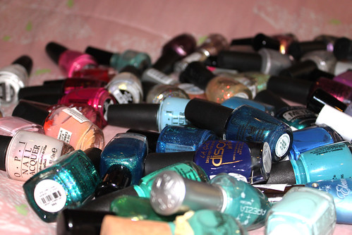
O Crackle Glaze, how I toiled to get you into my hands.

The elusive Crackle Glaze collection - while not limited edition, has certainly proved to be a challenge to get my hands on. But I've finally done it and gotten my hands on the 
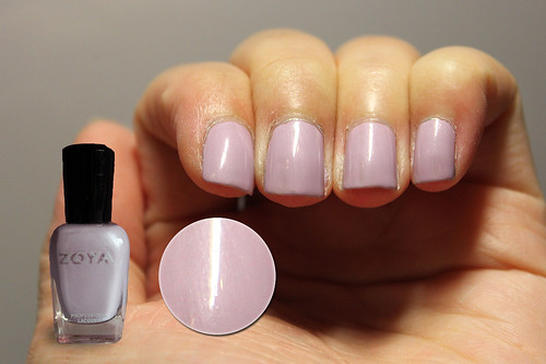
white one (Lightning Bolt) and hot pink one (Crushed Candy).

This is my first ever experience with shatter polish. My thoughts about it are mixed, but let's see the results anyway!

China Glaze Lightning Bolt

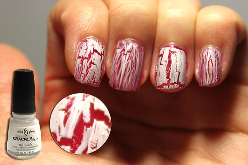
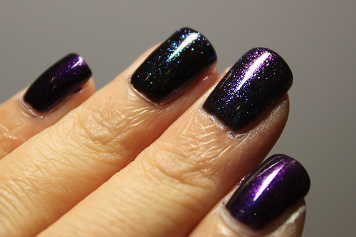
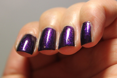
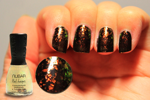
China Glaze Lightning Bolt one coat layered over OPI The One That Got Away from Katy Perry collection, one coat.

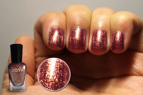
I was looking forward to Lightning Bolt more so than the other one because I personally don't quite like black and I wouldn't use OPI Black Shatter if I had gotten it. At that time, Lightning Bolt was the only white shatter in the market, so I was pretty excited. It is sad to find that it was not very user-friendly.

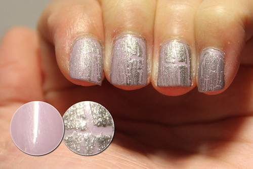
You might note that my index and ring fingers appear to have a more proper crackle effect than my middle and pinkie. I used a thicker coat of the polish on these two. I think shatter polish has a higher tendency to separate in the bottle than normal polishes, so I gave it a mighty good shake before I painted the ring finger, and the brush picked up a better consistency of polish.

Lightning Bolt dries matte but can also be semi-translucent if you don't use a thick enough coat. I personally don't like that effect because it'd look like you smudged some correction fluid onto your nails (but this doesn't look so bad after you apply topcoat). I found that it was more difficult to achieve the crackle effect than Crushed Candy, and less room for mistakes.

China Glaze Crushed Candy

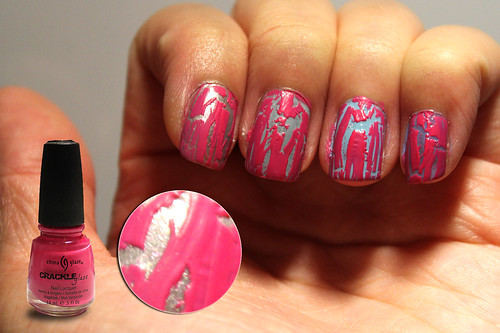
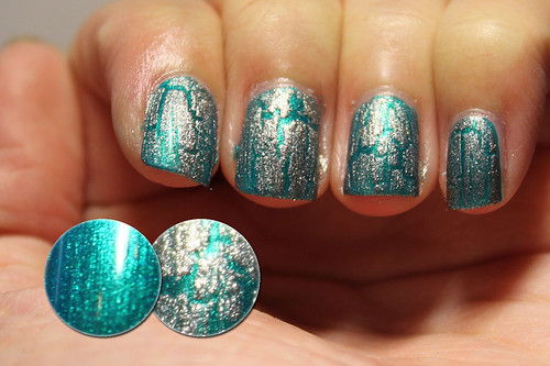
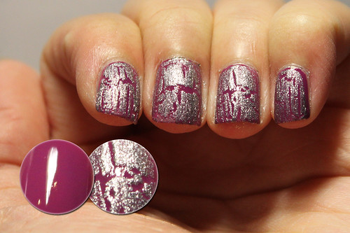
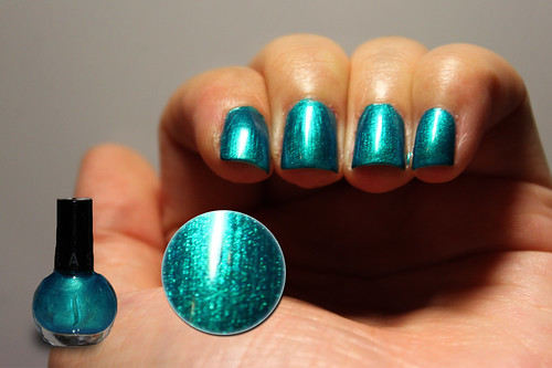
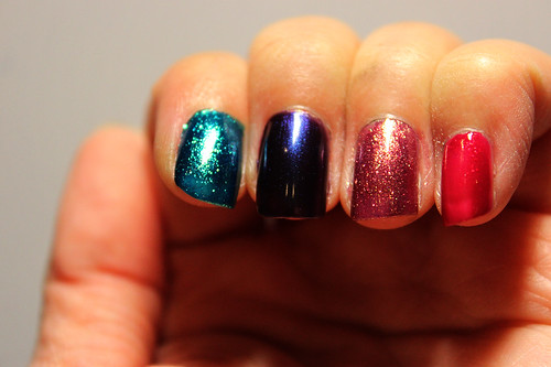
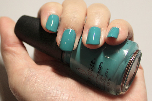
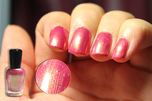
China Glaze Crushed Candy one coat layered over:
OPI That's Totally Fort Worth It (I), China Glaze Sea Spray (M), OPI What's With The Cattitude (R), Essie Lapis of Luxury (P)
(I - index, M - middle, R - ring, P - pinkie)

Crushed Candy is definitely way easier to use than Lightning Bolt. As long as you keep to the rules of shatter polish, i.e. try not to go over the same area twice, you'd achieve an acceptable crackle effect. It does seem to crack a whole lot more, compared to Lightning Bolt too, You can definitely see more base colour than LB too! Application wise, Crushed Candy wins.

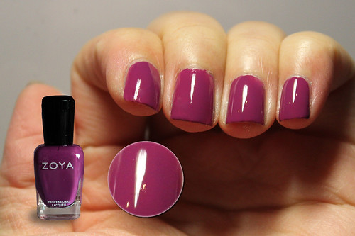
The downside to Crushed Candy is really finding a base colour that would work with such a hot neon pink. As you can tell, I couldn't decide which base colour to try this out on so I used a variety of grays and blues. I actually like them all. If you're going for a majorly in-your-face effect, I would recommend layering Crushed Candy over something light like a white polish (I tried it over China Glaze Snow), which would really highlight the neon-ness of the pink, or even a light blue like OPI What's With The Cattitude. If you want to go for a more subtle, neutral effect, then pairing it with something beige or silver or gray would work.

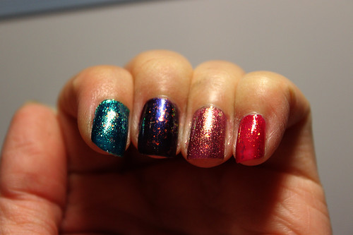
In both of these photos, I did not apply topcoat to show that both LB and CC do dry matte, so if you like that sort of effect, go for it. However, I can't vouch for the durability of the polish if you choose not to apply a topcoat, because from what I heard, crackle polish tends to chip notoriously fast without a topcoat. I personally haven't worn either of these as a manicure, especially not when I'm going to start my internship soon.

Some general tips for applying shatter polish:

- Only apply it over dry nail polish. Ideally, your nail polish should be so dry that it doesn't feel in the least bit sticky when you run your finger over it. After all, shatter polish works on the basis of contracting when it comes in contact with a nail polish, so it makes sense that your nail polish has to be as dry as possible.

- Apply only one coat. I found this a little difficult because we all have a habit of running over the same area twice when painting normal polish to make it even, but you'd have to dump that out of the window with this one. I reckon that it'd be a lot easier with OPI's thicker brushes which can definitely help in a one-stroke kill, but not so with China Glaze's smaller brushes. What I did was to apply the first stroke in the middle and then subsequently do the sides (not what I do with normal polishes). There may be some overlap which is inevitable.

- Don't wipe too much polish off the brush before you paint! After trying so many times, I realise that a small dab of the brush on the side of the bottle would be sufficient to remove any extra glob that you don't want messing things up. Do not actually wipe the polish, because when you need enough polish on the brush to cover the entire nail. You don't want to suddenly run out of polish in mid-stroke! (Trust me, you don't.) Beginners might find themselves with thicker crackle coats but at least you get a crackle coat at all. Running out of polish in mid-stroke means fail!

- It usually looks better after a layer of topcoat. Without topcoat, the crackle polish looks like it's just sitting on top of your base. Having a topcoat makes it look more integrated.

Have fun!

Zoya Reece

Zoya Reece

I had to quickly swatch this one because my mom bought it with me during the spree so I have to return it to her asap (not that she knows I'm swatching it, heh). Zoya Reece was one of the few polishes that I had my eye on since way back when, and I am not disappointed. It is a deep rose pink with a strong golden yellow-green duochrome shimmer that gives it a lot more depth and zest than it would otherwise have. Application was slightly thick but manageable. This was two coats.

I have to say that the colour of this photo is not entirely accurate, as I take my photos at night and my room lights are slightly warm and yellow. The duochrome has a very strong tinge of green in it that makes it slightly ethereal (though not as much as Zoya Adina). A very feminine rosy colour and the strong duochrome gives it, in my opinion, that rich class and elegance needed. Such a princessy colour, really! Love it.

I personally see a resemblance between this and China Glaze Strawberry Fields but not having the CG polish, I can't do a comparison. However, after having seen several photos of the two, I do think that Strawberry Fields is a more golden shimmer, whereas Reece's shimmer has a definite green tinge to it. Also, I think Strawberry Fields is a very slightly dustier rose pink, whereas Reece is slightly more vibrant in that aspect.

Wednesday, May 4, 2011

Orly Royal Velvet

Orly Royal Velvet

I wanna see your peacock - let's not continue.

This colour reminds me of peacocks, the moment I unwrapped it in the mail! Born from Orly Precious collection '11, Royal Velvet is definitely the most stand-out colour of the lot. To me, it was so anomalous from the rest of the colours in the collection that it defined the collection for me. This was undoubtedly the star colour and I was not disappointed. Application was smooth, with no bumps that I can remember. This was two easy coats.

The colour is a tricky one to describe but I suppose it's easiest to call it a dark royal purple, which is what it will look like at most angles and in most lights. However, when you look at it straight on, it becomes this rather vibrant blue base that shimmers its way into your heart (oooh, cheesy). I think the shimmer is so fine in this one, you can safely classify it as a duochrome.

On a completely separate note, I love Orly's rubber-grip bottle caps. I'm getting a small friction line on my palm from opening the likes of OPI, China Glaze and so on while I was cataloging my entire nail polish collection on my nail wheel (yes, my exciting post-exa preoccupations). Take a hint from Orly, other brands!

that's how you know exams are over.

that's how you know exams are over

My exams ended today.

HELL YEAH.

Monday, May 2, 2011

zoya spree and haul!

Oh boy, oh boy! I'm so excited to get down to swatching and reviewing these babies. I recently conducted a private Zoya spree amongst my friends and there was a total of 48 polishes ordered. When I finally got them all today, what else was there to do but to arrange them in order of the rainbow, as is due to my obsession with colours?

Zoya haul: isn't it a lovely day?

TA-DAH! I present to you the fruits of my Zoya spree. Obviously not all are mine. I only bought 9 for myself, the rest are bought by my friends. Isn't it a lovely sight? Here are the names:

Top row: Ginessa, Gaia, Jules (x3), Dove, Kelly, Dovima

2nd row: Shivon, Isla, Tiffany, Reva, Faye (x2), Parker, Lulu, Cassi (x2), Tanzy (x2)

3rd row:
Irene, Apple (x2), Gemma, Charla (x3), Breezi (x2), Phoebe, Crystal, Jo, Caitlin (x3)

4th row:
Marley, Ibiza, Julieanne (x2), Valerie, Adina, Mira, Kieko (x3), Reece (x2)


And here are the spoils of my own haul which I am very excited to begin swatching and reviewing as soon as my exams are over (2 more days!)

Zoya haul: what's mine's mine.

L-R: Megan Miller Collection - Carribean, Zoya Jules, Charla, Apple, Breezi, Faye, Caitlin, Kieko, Reece, Marley

The Megan Miller one is a present from my friend from the US. I've never heard of this brand but the colour is lovely! (: Seriously, cannot. wait. to. swatch.

Stay tuned!