Wednesday, March 30, 2011

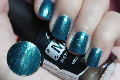
L.A. Girls Deep Sea Micah

L.A. Girls Deep Sea Micah

It's not many days that I get to be able to swatch freely when the sun is still up. I usually do my swatching at night when I come home from school (that's when you see a yellowish lighting from my so-called flourescent lamp).

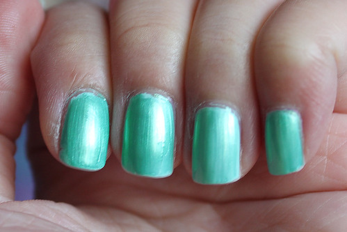
So I just happened to pop by Guardian Pharmacy this afternoon and after shamelessly testing out some L.A. Girls nail polish (non-testers, cough), I decided on buying this one as the most likely one I'd wear even though at the point in time, I preferred the hot pink, green and purple tin foils on my other fingers. The blue seemed lacklustre and a whole lot less shiny next to the others. But I'm more of a blue person, so I got this anyway. When I walked out into the sun, it was a shock to discover that this blue does not lose in terms of sparkliness at all to its warmer-coloured counterparts.

Application for this one was lovely, if on the sheer side. I think this was possibly about 3 or 4 coats. I used to not have much of an impression of L.A. Girls because I've never really seen them being mentioned almost at all on nail polish blogs and I generally don't trust stuff I see on Singapore shelves. Because the first nail polish I bought was from their Matte collection and it wasn't very satisfactory. Plus, it separated! So I thought it was rather low-quality, but hey, this is starting to make me appreciate a different side of it.

It kinda looks like Cuckoo For This Color from the OPI Swiss collection, so I whipped out my Yodel Me On My Cell for a comparison (to be later posted). Was rather shocked at how similar they were but Deep Sea Micah is more of a cooler green and interestingly, has more shimmer/sparkles than Yodel. Is the nail polish giant going to be one-upped by a two-bit varnish company?

All in all, I have a really really good impression of this polish and can't wait to try it out as a full manicure!

Sunday, March 27, 2011

Essie Mint Candy Apple + Arezia #697
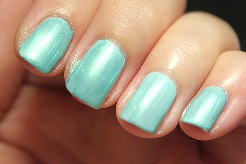
Essie Mint Candy Apple + Arezia #697

This is 1 coat of Essie Mint Candy Apple from the Winter '09 collection and 1 coat of Arezia #697.

I always have issues putting on Mint Candy Apple. It seems awfully streaky! And not only is it streaky, it actually bubbles. I'm not sure if I'm doing anything wrong but I really had to take some time out to apply this one. However, since I knew I'd be layering a coat of Arezia #697 over it, I decided not to polish up the streaks and holes since it'd be camouflaged by the additional coat anyway.

I'm not sure which country does Arezia come from, but I'm loving what I see of their polishes so far. This is a pearlescent blue-mint colour that you can layer on something else like what I did here, or wear it by itself. If worn by itself, it only requires 2 coats for opacity, but the colour is a lot greener than it looks here, since this is layered over a mint base. It does give it a bit of a frosty finish but I seem to like to this effect quite a bit. It's somehow freakishly glowy. It's sold at SGD $4.00 at Sasa Beauty, which is awesome cheap. Not just that, there's a Buy One Get One Free promotion going on there right now.

Edit:

Essie Mint Candy Apple + Arezia #697

I realise that this photo is more true to how the colour of my manicure really was. It kinda looks like the green tack that I used in school recently. Still - got a lot of compliments with it.

Hot pink comparisons

Hot Pink comparison

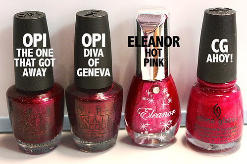
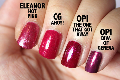
I decided to do this one because my friend insisted that I was buying the same colours over and over again, so this is to prove to her and also myself that I haven't, really. XD As you can tell, they do look pretty similar in the bottle, and I was worried myself that I've been buying dupes but - obviously not.

Hot Pink comparison

I don't really quite know what brand is Eleanor, but I saw it in a big basket of a local beauty shop and decided to get my hands on it.

OPI Diva of Geneva from the Swiss collection '10 is an obvious cool purple with a hint of gold in it. OPI The One That Got Away from the Katy Perry collection '11 is a berry pink on the darker side with large glass flecks in it. China Glaze Ahoy! from the Anchors Away collection '11 is a hot pink base with golden micro-glitter which makes it lighter and warmer than The One That Got Away. Eleanor doesn't really have a name for its polishes but I'm just going to go ahead and call it Hot Pink. This is a more muted dusty pink packed with silver glitter.

Love them all, anyway! I've worn OPI The One That Got Away and OPI Diva of Geneva as manis so far, not the other two yet. Looking forward to Ahoy! It look hawt.

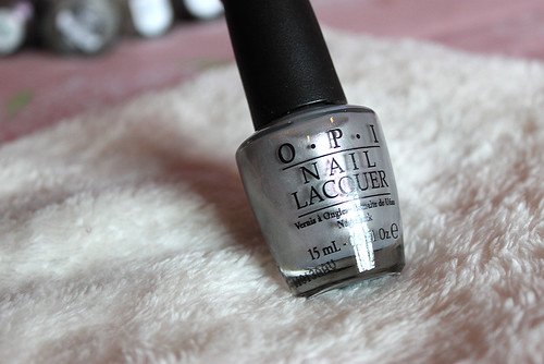
OPI It's Totally Fort Worth It

OPI It's Totally Fort Worth It

From the Texas collection '11.

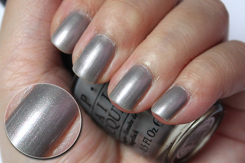
I really bought this on a whim but it turned out way better than expected. However, be prepared that the formula is watery and sheer, which is a problem that seems to be experienced across the board. This was probably like, what, 4 coats? Or more? I lost count, really. Other than that, it's a gorgeous dove grey that has a subtle pink shimmer that saves it from being boring. I've definitely received compliments on this one. However, because of the shimmer, it doesn't end up with a high-gloss finish, even with a coat of Seche Vite over it, so be prepared for that one. Brushstrokes are definitely visible as well, but if you practise and get your technique right, the even brushstrokes make the polish that much nicer.

I've been wondering whether I ought to add on Zoya Dove to my collection but really, after trying out this one, I decided that it would be redundant to buy Zoya Dove so I opted for Zoya Marley instead. :D Hope the Zoya stash arrives soon.

Sunday, March 6, 2011

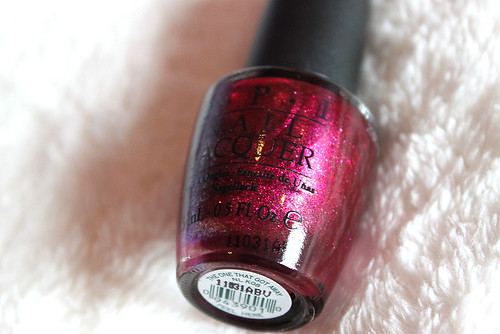
OPI The One That Got Away vs OPI Diva of Geneva
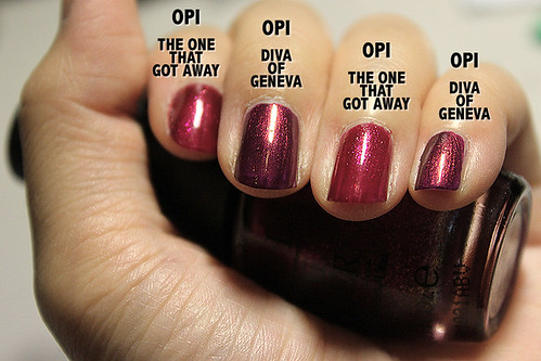
I was pretty curious to see how things would turn out. They aren't all that similar, you can tell that there are obvious differences. The One That Got Away is more glowy, the glass flecks are obviously huger and there isn't any duochrome effect as in Diva of Geneva. Here they are on the nail.

OPI The One That Got Away vs OPI Diva of Geneva

You can already see the fine gold shimmer of Diva of Geneva amidst a purple base (sorry the photograph turned out a bit strangely coloured), and the obvious larger sized glass flecks for the more berry/red colour of The One That Got Away (this one is slightly more accurately coloured than Diva of Geneva).

I have to say that The One That Got Away (phew, such a mouthful everytime I have to say it) is an annoyingly difficult polish to capture on camera. It almost always turns out far too red than it really is on the nail. I'm not one for red polishes, but I love this on the nail. I wouldn't call it a true red, there is a definite hint of berry in it. "Berry" is really the most apt descriptor I can think of for it, and the glass flecks? Winning formula, OPI.

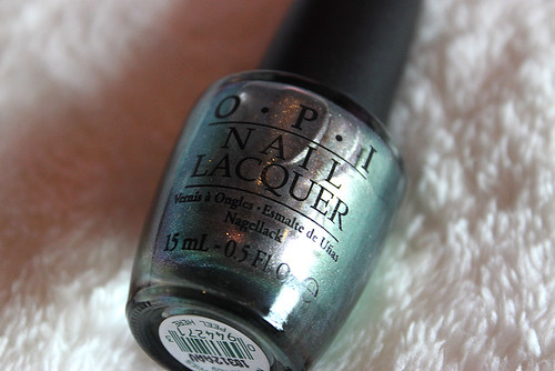
OPI Not Like The Movies
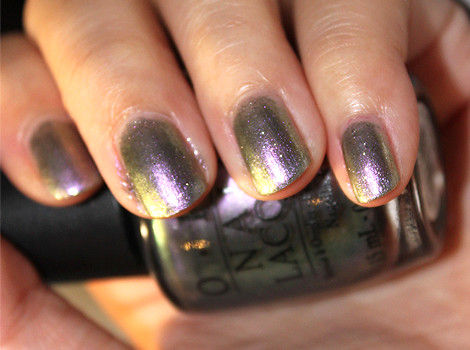
OPI Not Like The Movies


OPI Not Like The Movies, from the Katy Perry collection of 2010, is a duochrome colour with sparse silver glitter to give it an extra bling. I would hesitate to pin down any colour on it because it's those sort of colours that just can't make up its mind. In dim lighting, it appears like a shiny darkish silver colour, but once it gets enough light, it'll start to look anything from pale lavender to a forest green and when the two mix, you get an olive green. Under a sunset, it even appeared shimmery gold!


I was very undecided whether I like this colour at first. If you're not the type to want to go wild on your nails, this isn't a colour for you. It will not stay predominantly any one colour. Some of my friends didn't like it either because they didn't quite like the lavender-purple (which could appear muted in some lights) or because it was just weird for them. Personally, I thought that under certain lights, particularly indirect light, the glitter in the polish could actually make your application messy, even if it is really flawless.


This was also surprisingly sheer. I had to do about 4 coats to achieve that opacity in the photo. Not exactly a favourite polish, but I would wear it again if I'm feeling funky and weird.

Thursday, March 3, 2011

Wowshop haul!
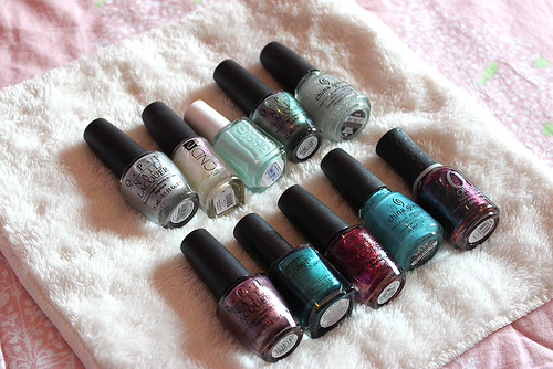
Overview

Hauuuuuuul.


So recently I bought from an online etailer called Wowshop. I'll be writing a review on them soon, but I'm really happy my nail polish is here! :D There are a couple of set-backs, like the mini Orly bottle that Liao ordered is not in the box, and my Color Club Rule Breaker cap has no brush, but all in all, very pleased with my haul indeed!

On with the photos!


SWATCH ONE
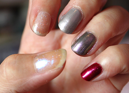
Swatch 1

L-R: CND Sapphire Sparkles, China Glaze Fairy Dust, OPI It's Totally Fort Worth It, OPI Not Like The Movies, OPI The One That Got Away

-- CND SAPPHIRE SPARKLES

CND Effects

CND Sapphire Sparkles

CND Sapphire Sparkles

A sheer polish with glitter that flashes pink, purple, blue, green. This thing is awesome. A little pricey, but awesome. I can foresee that I would want to restock this when I run out, because it is that awesome. The camera can only capture a third of its duochrome awesomeness. I love things that flash different colours at different angles. This polish would surely brighten up any dull manicure. I can foreesee that it will be amazing over black. Shall wait for my black polish to arrive to have a look. This was 2 coats.

-- CHINA GLAZE FAIRY DUST
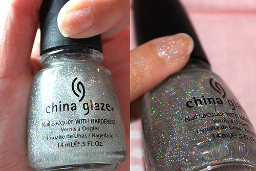
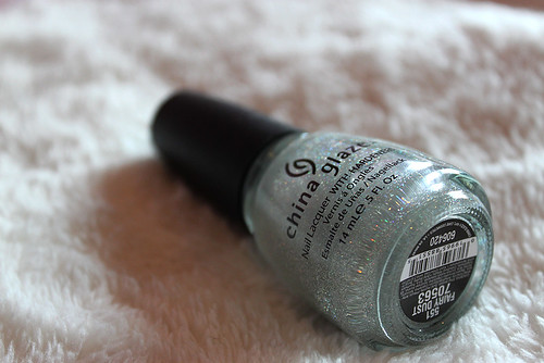
China Glaze Fairy Dust

China Glaze Fairy Dust

Another sheer polish that is definitely not camera-shy with its fine holographic glitters. I was worried that it might be a bit too coarse, or that the holo glitters wouldn't come out right, but my worries were unfounded. I can definitely see myself layering with this some time. I like how you can control the amount of glitter you layer on. One coat leaves a relatively sparse amount of glitter should you want to layer this over something that's already shimmery, but pile on the coats and you'll have yourself a blingfest of holo glitters in no time. The glitter spreads evenly. Very pretty. This was 2 coats.

-- OPI IT'S TOTALLY FORT WORTH IT

Texas collection '10
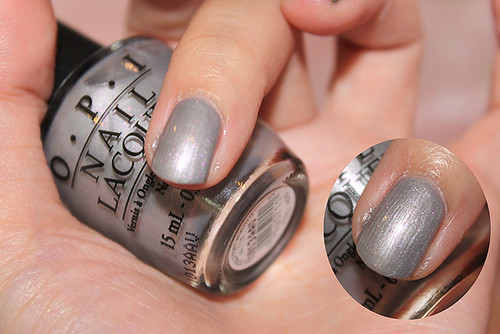
OPI It's Totally Fort Worth It

OPI It's Totally Fort Worth It

I'm not really sure what this name means. Anyway, it's a muted silver with a tinge of lavender to it, that has glitters that may or may not be visible depending on the lighting. I thought the glitters were orange in the day, but now under my lamp light at night, it appears to be pink. Strange! The finish is semi-glossy, and some of the glitter does sink in, which gives it a very slight grainy appearance but it's not noticeable at all. A cover of your regular topcoat should do the trick very adequately. This was 3 coats.

-- OPI NOT LIKE THE MOVIES

Katy Perry collection '10
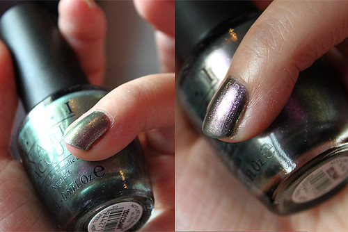
OPI Not Like The Movies

OPI Not Like The Movies

OMGOSH, this turned out way better than I expected! "Oilslick" couldn't have been a better term to describe how this looks. This is a slightly dark silver that flashes purple and green and when I say flash, I really mean flash. The duochrome in this is pretty amazing. At certain angles, my entire nail appears green, while at others, I see purple. I love this, given my weakness for duochromes. Considering this for my next mani! Application is a little streaky but it should even out while drying. It's surprisingly sheer though, there is a very slight, almost invisible VNL even after 3 coats. I can live with it, though. This is 3 coats.

-- OPI THE ONE THAT GOT AWAY

Katy Perry collection '10
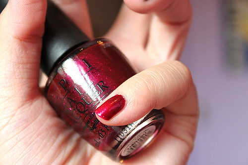
OPI The One That Got Away

OPI The One That Got Away

This is a reddish-purple colour, I'd call it berry, just simply loaded with glass flecks! The flecks are big, but it works. The colour is more true to the colour in the bottle. It's such a vibrant berry colour that it almost seems to glow, really. Opacity can be achieved in 1 or 2 coats max. Super sparkly! This is 2 coats.

SWATCH TWO
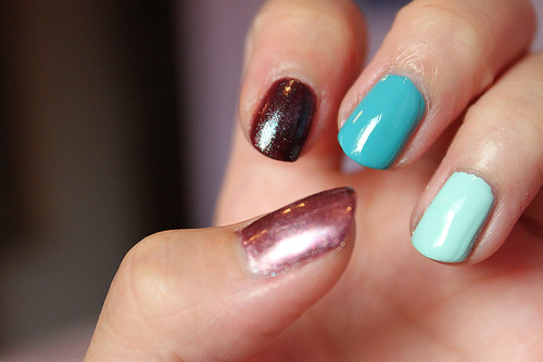
Swatch 2

L-R: OPI Meet Me On The Star Ferry, Orly Galaxy Girl, China Glaze Flyin' High, Essie Mint Candy Apple

-- OPI MEET ME ON THE STAR FERRY

Hong Kong collection '10
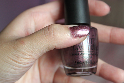
OPI Meet Me On The Star Ferry

Perhaps a proof of how uninteresting the bottle looks is that I actually forgot to upload the picture of the bottle only. Or perhaps I forgot to take a photo of it. Anyway, the bottle looks rather uninteresting, like a muted burgundy colour with normal red-green glitter. However, on the nail, it somehow works. I really like this! It seems to have a hint of gold to it that's so subtle, you'd have to follow some sort of intuition to realise that it's there. This is very thick, and I actually only have 1 coat on there. The only thing you need to watch out for is brush strokes! They are quite visible. The finish is semi-glossy. It is quite messy to take off, though!

-- ORLY GALAXY GIRL

Cosmic Fx collection '10
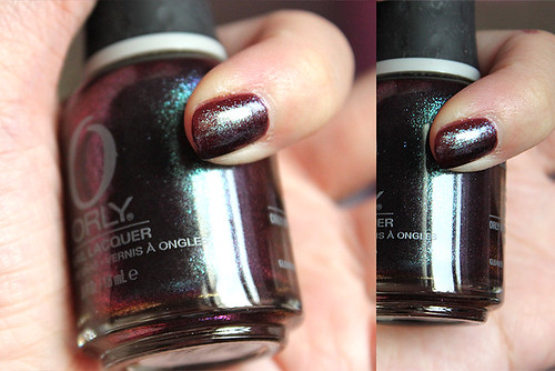
Orly Galaxy Girl

Orly Galaxy Girl

Orly Galaxy Girl

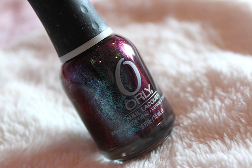
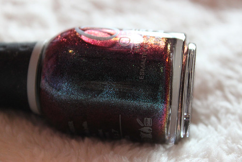
Wow. I love this one so much, I need 3 photos of it. Being the duochrome fetishist that I am, you can just imagine how tremendously excited I was to stumble upon the Orly Cosmic Fx collection. If I can, I need to collect ALL polishes in this collection. Galaxy Girl was one of those that I felt like buying but yet was a bit unsure about because I've read reviews about it looks bruise-coloured, and so on. I knew I wouldn't rest if I didn't buy it and I absolutely do not regret it. Though I usually don't quite like to wear dark polishes, Galaxy Girl makes me feel like I have a window to the universe on my fingers. Plus, I'm an astronomy freak. The duochrome in this is insane. True, the base colour is a dark maroon with a tinge of brown that almost makes it look like very dried blood but the awesome glitter duochrome in it will offset it all. Cannot emphasize how much I love this. This is 3 coats.

-- CHINA GLAZE FLYIN' HIGH

Up & Away Spring collection '10
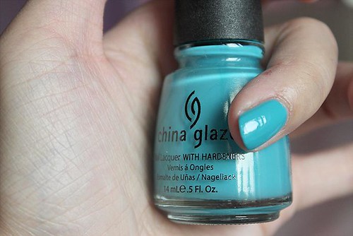
China Glaze Flyin' High

China Glaze Flyin' High

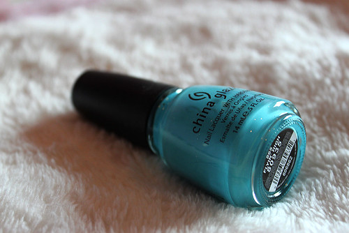
I had an impression that this was a blue-green creme and actually, I'm not sure if I'm wrong. The colour is really difficult to pin down because it seems to be different colours in different sort of lights. It could be darker aqua, or it could be a teal. I'm not sure, but I do love this colour. It's not quite sky blue, I am convinced there's some green mixed in there somewhere, but it flatters my skin tone tremendously and looks vibrant and fun! Looking forward to wearing this. Thick, as per usual. 2 coats.

-- ESSIE MINT CANDY APPLE

Winter collection '09
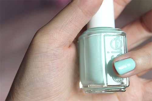
Essie Mint Candy Apple

Essie Mint Candy Apple

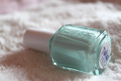
This isn't really quite the true mint. It leans more towards blue but that is exactly what I like. I like that in-between colour, and if I had to choose, I'd pick blue anyway. I don't generally like pure green polishes. Anyhow, this is a mint creme that is the usual thick Essie formula as well, and covers in 2 coats.

All in all, very pleased with my haul. Still deciding between Not Like The Movies, Galaxy Girl and Flyin' High for my next mani! If I ever get down to swatching them, will post the photos up! (:

Tuesday, March 1, 2011

Swatch of boredom.

Well, no. I'm not actually bored. I do have better things to do (like school), but I took to swatching my brand-new nail wheel anyway. Here are the 12 colours I currently own


  1. Four Leaf Clover by China Glaze, Up and Away collection '10. Hmm. I realise my camera made it look bluer and darker than it really is. This is a tremendously bright, pure green creme which covers very opaque in 2 coats. Asian people might recognise this green to be something similar to the back of mahjong tiles. I bought this upon the urgent recommendation of many nail bloggers out there, but then I realised that I'm not really into the pure greens much. Not only do I not have clothes to match, but it also makes me look rather like a mahjong-playing auntie. However, for green lovers out there, it definitely is a must-have colour. Just... not my style, I guess. This is also currently my only bottle of China Glaze polish, so I can't compare how good/bad, thick/thin the polish is.


  2. Yodel Me On My Cell by OPI, Swiss collection '10. This has got to be one of my favourite nail polishes of all time. I randomly bought this at a bazaar in school, and it was like I unlocked (like a RPG, get it?) a huge obsession with blue-greens, as well as a weakness for shimmers and glitters. This is a aqua blue with a teal/dark turquoise flash and blue shimmer in it. Application is fine, it covers in about 2 coats, but I usually add a 3rd coat to make sure. When I Google it, I find that most photographs I see out there depict it to be lighter than it really is. I'm not sure how, but I managed to capture the right intensity of the colour, as I view it in real life.


  3. What's With The Cattitude? by OPI, Shrek collection '10. A pastel baby blue creme. It is definitely a few shades lighter than what is shown in the picture. I like this, it flatters my skin tone and looks quite sweet but unique at the same time (although I notice an upward trend in people wearing blue polishes). Application was noticeably streakier than most other OPI polishes, and I usually need 3 or 4 coats to get an opaque, unstreaky finish but it's possible. My friend describes it as 'balloon blue'.


  4. Lapis of Luxury by Essie, Resort collection '10. A lot of blogs out there also rave about this one and call it a light periwinkle blue. I imagined it to look something similar to Cattitude above, but it turned out greatly disappointing. It's a tad more purple, and also a shade lighter. This is definitely a unique blue, haven't seen any dupes around, but it somehow does not flatter my skintone at all. I can imagine it looking better on whiter, Caucasian skin. Anyhow, application was all right, needed about 3 coats for full opacity. I wore this for Christmas, with a layer of white shimmer over it for a frosty snowy look.


  5. Mesmerize by Essie, Spring collection '10. This is a deep blue, just a few shades before navy. I find this colour vibrant (or maybe I just haven't seen enough blues) and unique! I haven't worn it on my fingers yet because I'm afraid it'll turn my nails all blue (because it's such a deep blue), but I've worn it at least twice or thrice on my toes so far (because who cares about toe nails?).


  6. Dance Studio by L.A. Girl, Black Light Disco. Have not yet tested this polish in black light so can't tell you if it glows or not. I'm not sure why it looks black in these photos but it's actually a more royal, slightly darker version of Mesmerize above. It almost seems to radiate, somewhat. Maybe it will show up in black light. I wouldn't be surprised. There is a pseudo-neon quality about a dark colour that makes you feel that they've definitely played with some fluorescent-related chemicals in there.


  7. Who Needs A Prince? by OPI, Princesses Charming collection. Another one of my absolute favourites. It's a white creme base with red shimmer so it looks virtually pink on the nail. It's pretty sheer so you need at least 4 coats to achieve opacity but it is buildable. I actually get distracted by my nails when I paint this colour. It's only red where the light hits it, and everywhere else is white/pink. I LOVE IT. I can't emphasize that enough. I'm even thinking of buying more from the same collection.


  8. Pop Art Pink by Essie, Spring collection '10. This is a lightish pink creme that is somewhat sheer to apply and requires at least 3 coats for some kind of opacity. I think it looks gorgeous on Caucasian hands but on a Chinese girl like me, it makes me look a little like Barbie. It makes me think my nails are plastic, because it's the shade of pink that I used to see on my plastic Barbie doll house. Anyway, that's not to say it's not a nice colour. I'd definitely wear it again. It is also perfect for layering with shimmers and what not.


  9. Matte Pink by L.A. Girls, Matte. Honestly, I have no idea what the name of this polish is because the label peeled off. I'm just assuming since the other one is Matte White. Anyway, the first few polishes that I bought, and the first matte. I never tried this for the longest time and I actually still haven't worn it. The pink has quite a significant hint of coral in it, and perhaps even a tinge of peach. Orange, as I have found out, is not quite my colour. Anyway, matte also tends to dry with visible brushstrokes, which isn't cool. I'm not a fan of this colour.


  10. Diva of Geneva by OPI, Swiss collection '10. Another favourite. This is a royal purple duochrome that flashes - red? red-purple? In the bottle, it flashes a gorgeous gold which never quite translates onto the nails. Despite this small set-back, the shimmer in this polish is enough to win me over. It dries to a semi-matte finish and is very flattering on my skin tone. I love how in some lights it almost appears dark maroon-purple. Amazing, love it.


  11. Janice by Zoya. This is a red creme with a berry/pink duochrome, which is barely visible. The red is brighter than what is shown in the photo, and leans towards the fuchsia side. It just looks like a red creme to me unless I hold it up to my eyes. I'm not sure if it's because I found it in my mum's drawer (typical) and it could be a thousand years old for all I know. Red isn't quite my thing. If the duochrome was more obvious, I would possibly give it more chances, but after painting it on my toes for a bit and feeling utterly vampy, I'd probably stay away from red from now on.


  12. Matte White by L.A. Girls, Matte. This is all right. One of the first few polishes I painted since I stepped into my obsession with it. Although I don't quite like mattes, white doesn't seem that bad. It doesn't make your nails look and feel as fake. You can't really go wrong with white, really.