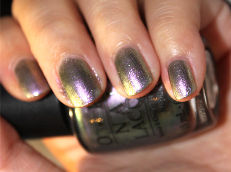
OPI Not Like The Movies, from the Katy Perry collection of 2010, is a duochrome colour with sparse silver glitter to give it an extra bling. I would hesitate to pin down any colour on it because it's those sort of colours that just can't make up its mind. In dim lighting, it appears like a shiny darkish silver colour, but once it gets enough light, it'll start to look anything from pale lavender to a forest green and when the two mix, you get an olive green. Under a sunset, it even appeared shimmery gold!
I was very undecided whether I like this colour at first. If you're not the type to want to go wild on your nails, this isn't a colour for you. It will not stay predominantly any one colour. Some of my friends didn't like it either because they didn't quite like the lavender-purple (which could appear muted in some lights) or because it was just weird for them. Personally, I thought that under certain lights, particularly indirect light, the glitter in the polish could actually make your application messy, even if it is really flawless.
This was also surprisingly sheer. I had to do about 4 coats to achieve that opacity in the photo. Not exactly a favourite polish, but I would wear it again if I'm feeling funky and weird.
No comments:
Post a Comment