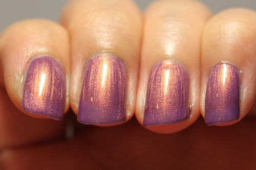
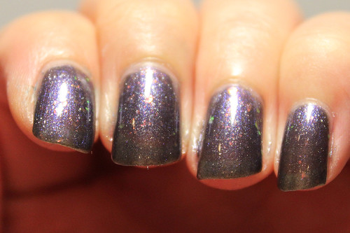
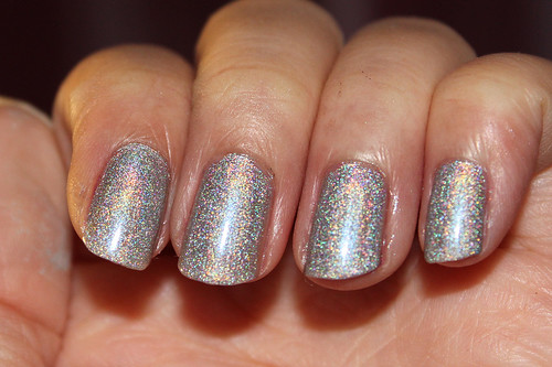
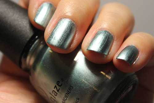
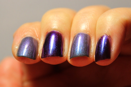
Thursday, July 7, 2011

Orly Fantasea

Orly Fantasea (1/2)

Orly Fantasea (2/2)

This was 3 coats, no topcoat.

I've fallen in love with Orly Fantasea ever since I saw swatches of it on another nail blog. I tried to find it on various nail polish etailers but to no avail. I think it's a really old polish but I finally found a bottle of it at the local nail polish shop. It's beautiful, isn't it? There's something ethereal about it, similar to Zoya Adina, but with a gold-bronze duochrome/shimmer. Zoya Adina, having a green flash, makes it look ethereal in a ghostly sort of way, but Fantasea really looks soft, delicate, fantasy-ish like its name.

Application was OK, a bit on the thin side. A little of VNL here despite it being 3 coats, but it's all right with me. (: I've no idea which collection this is from.

Bisque - Ocean Glow

Bisque B077 (aka Ocean Glow) (2/2)

Bisque B077 (aka Ocean Glow) (1/2)

This was 2 coats, no topcoat.

Bisque is a brand I found in China which is majorly, majorly cheap. Also, the quality of their nail polish is surprisingly good. I bought more than 10 bottles of this brand in various colours, so you can expect to see more of these coming right up. This first example is my favourite nail polish from Bisque. It's a very rich medium blue, almost bordering on dark. It reminds me of Essie Mesmerize, except slightly brighter. But inside the polish, it's chock full of blue-green shimmer which reminds me strangely of the mermaid sheen in Charla.

While the shimmer does not match up to the sheen in Zoya Charla, I don't think that was the purpose. Zoya Charla comes off as blue-green from afar, whereas Ocean Glow is distinctly blue. I did do a comparison but it was so awfully painted (I was dizzy from my flight back) that I decided not to upload any pictures. As for the quality of this nail polish, I actually think it's better than some of the more 'established' brands like OPI and China Glaze. I only required 2 coats to reach this opacity. Also, when I did the comparison with Charla, this polish was extremely easy to take off. I was afraid it would give me smurf fingers because of how rich the blue is, but it only took me one swipe of the cotton wool to get it off. Charla, however, took me a ridiculous amount of time. There's something about Charla that doesn't quite respond to nail polish remover.

Anyhow, this was RMB 4, which translates to S$0.80. Yes, I paid less than one dollar for this 0.53 Fl Oz bottle of polish. From what I've swatched on my nail wheels for the rest of my Bisque haul, the quality does not disappoint either. More to come!

Sasa Tinnie - Darkened Flame

Sasa Tinnie 1M9 (aka Darkened Flame)

This is 4 coats, no topcoat.

Also bought from the Hong Kong Sasa, this is a dusty dark purple base with orange/green flakes in it. It reminds me strikingly of Orly Fowl Play from their Birds of a Feather collection, though the purple is definitely more gray and desaturated than that of Fowl Play.

As with the other Sasa nail polish I bought, Peacock Feathers, Darkened Flame has no actual name so I decided to give it one because who wants to call it 1M9 all the time, right? Also like Peacock Feathers, Darkened Flame is very thin and requires 4 coats to reach this opacity. However, because the base is dark, the VNL is much less visible on this one than with Peacock Feathers.

I like the flakes in this one, but I think the base colour could be richer. The grey-purple does look a little dull, though the flakes in the polish save it from becoming too boring. This was HK$20 per bottle, since it is full-sized unlike Peacock Feathers, which translates roughly to S$3.30. Cheeaap!

Sasa Tinnie Mini - Peacock Feathers

Sasa Tinnie Mini SME303 (aka Peacock Feathers)

This was 4 coats, no topcoat.

I picked up this baby in the Hong Kong branch of Sasa, a make-up and beauty store. I love, love, love this colour. It comes in a mini heart-shaped bottle that's about 5.5mL so it's quite tiny. The handle is just a little pink pearl so it's a little hard to hold but nothing major. The only complaint I have about this polish is how thin it is. It took 4 coats to reach this opacity and even then, there's still VNL.

This polish has no name anywhere on the label so I decided to call it Peacock Feathers. It's basically a blue-based polish, but the blue only really appears at the sides. Inside is a rich yellow-green that's dotted with bronze glitter. The effect is amazing, it's the one polish I have that truly looks so much like peacock feathers.

I just wish it was more opaque and in a bigger bottle. This cost me HK$7.50 for one, which translates to S$1.25. Awesome!

Wednesday, July 6, 2011

back from holidays!

Hello everyone!

Sorry for the short absence, but I've been away on holiday. :D And I am excited because I think my nail polish collection just exploded while I was in China. It was a madly cheap SGD $0.80 per bottle!

I KNOW, RIGHT?! How could I possibly resist? :D I swatched them on my (extremely cheap) nail wheels as well and the quality seems all right so far. Since it was so madly cheap, I took the opportunity of getting colours like orange and yellow which I would normally not dare to buy with the more expensive brands like OPI and China Glaze, so I can try out which colour is nice on me!

In addition, I also haven't quite finished swatching my recent haul with 8ty8beauty. LOTS OF SWATCHES COMING UP, I HOPE.

Thanks for sticking with me! :D

Saturday, June 25, 2011

Color Club Worth The Risque

Color Club Worth The Risque (1/4)

Color Club Worth The Risque (3/4)

Color Club Worth The Risque (2/4)

Color Club Worth The Risque (4/4 - flashed)
With flash

From the Femme Fatale collection 2009.
This was 3 coats, without topcoat.

This is proof that not all valid holos need an Aqua Base, or has to be linear, or from the China Glaze OMG collection. I was initially hesitant. I wondered if Color Club, one of the secondary brands to my mind, can produce a decent holo. This polish threw my groundless doubts away and stomped all over them before burning. This is an amazing holo, so much so that it almost looks like a nail foil! Doesn't it look like I just stamped a piece of foil on my nail?

It is a scattered holo that is definitely silver, unlike OPI DS Sapphire. I have heard that though it required 3 coats to reach opacity on the nail, it does an excellent job as a stamping polish on Konad so I'm definitely going to have to try that soon. A holo stamp! That is immeasurable prettiness. The photo with the flash reminds me of those Pokemon trading cards I used to collect as a kid, with its holo borders. I love how fuzzy it is. I am beginning to appreciate scattered holos as much as I do linear holos.

I also bought Color Club Revvvolution (I always can't keep track of how many 'v's there should be in its name), which is sort of its black holo counterpart, and I am eager to swatch it for you! I think I shall try out a Konad with Revvvolution as the base and Worth The Risque as its stamp.

As a side note, my friend bought Color Club Fashion Addict, from the same collection and is a lavender scattered holo. It looks remarkably similar to my OPI DS Diamond! Perhaps I might get her permission to use it in a comparison between the two. If they are dupes, then Fashion Addict would prove to be a cheaper alternative to the slightly more expensive Designer Series by OPI.

Color Club Electro Candy

Color Club Electro Candy (2/2)

Color Club Electro Candy (2/2)

From the Electro Candy collection 2009.
This was 3 coats.

Mine eyes, they do dazzle.

Seriously, when I was applying this, I felt like I was applying pink highlighter fluid. This is now the brightest polish I own. I think anyone could see this a mile away. Electro Candy is a neon bubblegum pink with a hint of coral, and also with a turquoise shimmer that is hardly noticeable on the nail. Even in the bottle, you'd have to tilt it at a certain angle to see a glimpse of it. Anyhow, I think I can safely say that I would not be wearing this polish on its own. It's just not becoming to blind passers-by.

Really though, the brightness of this polish almost seems to give it a quality like it's glowing. It's a bit surreal. Even when I view it in a dark corner of my room, it's almost as if it's glow-in-the-dark (which, of course, it isn't). I was also quite sad to see that the turquoise shimmer didn't come through very much on the nail. I'm not sure if it's because the polish itself is just way too bright to let any other distractions come through, or whether it's the fault of the formulation.

However, application-wise, I have nothing to complain about. Each coat dried remarkably fast, as was the case with its counterpart, Ultra Violet. By the time I was done with the pinkie on one hand, the index was sufficiently dried to begin the second coat. I'm undecided as to the brightness of this polish. It's really the first neon polish I own and I am shocked that they can even formulate such an amazingly bright colour. I'm generally not one to wear such madly bright polishes. Mad colours, yes. Madly bright - meh.

OPI Houston, We Have A Purple

OPI Houston We Have A Purple (1/2)

OPI Houston We Have A Purple (2/2)

From the Texas collection 2011.
This was 3 coats, without topcoat.

I have to say that every time I'm forced to photograph such colours like these and Do You Think I'm Tex-y, it nearly gives me a brain hernia at how red it comes out in my photos. I confess I tweaked the colours on Photoshop to make it even remotely similar to the original colour. OPI Houston We Have A Purple is a grape coloured jelly that is visibly and significantly more purple and darker than its counterpart Do You Think I'm Tex-y, but my camera begs to differ.

I currently have this and Do You Think I'm Tex-y painted on alternate fingers, and using the syrup nail technique. I love how it looks! It really reminds me of the Hi-Chew grape flavoured candy. I can almost just taste it. I really like jellies. They're not as ostentatious as glitters, cleaner than duochromes, and not as boring as cremes. I love how squishy and shiny and soft and gummy-like it looks. It really makes me feel like eating them. D:

Can you imagine if they had scented jellies in the future? Like if they really smelt like Hi-Chew gummies? I think I'd go wild with cravings everytime I opened the bottle, much less painting it. OMGAH!

Anyhow, fancies aside, I have to say that perhaps it's due to the nature of the sorbet finish that this polish is meant to have, but the formula seemed rather watery and runny, as was the case for Do You Think I'm Tex-y as well. It's really difficult to keep the polish from pooling in my cuticles while painting, and quite a bit of clean-up was required. I did notice, when I was dabbing excess polish back into the bottle, that perhaps in order to achieve that sorbet effect, they did have to make this polish thinner than usual. In the bottle, it looks more like syrup than nail polish. However, I like the jelly finish so much that I would say this pooling thing would not deter me from buying more.

Do you like jellies? What do you think of scented jellies?

Zoya Loredana

Zoya Loredana (1/2)

Zoya Loredana (2/2)

From the Matte Velvet collection 2009.
This was 3 coats.

This is my first matte polish in a really long time. As I've mentioned before in my haul post, I'm really delighted with the bottle. For all their matte polishes, Zoya gave a little twist to their usual high-gloss glass bottles, and instead packaged them in a frosted glass one. While this may compromise visuality of the polish inside (like how I didn't manage to see the exact shade and the glitters in this one until I opened the bottle), but it gives it a really cute just-out-the-fridge effect and, of course, makes it look appropriately matte.

I had however, expected Loredana to dry faster than it did, since matte polishes are meant to be some of the quickest-drying polishes out there. It wasn't slow, just that it wasn't as fast as I had expected. No matter, however. It is a gunmetal grey shade with a whole lot of silver glitter in it, though the glitter is a little diminished when it dries matte. I don't foresee that I shall be wearing this on its own very much, since I generally do not like black-ish polishes, but I think this will make a great base for nail art. Somehow, it always looks nicer when there's a mixture of gloss and matte. Not to mention, I've seen photos of Loredana with topcoat and it looks fab! I can't think why I forgot to take a picture of that.

Friday, June 24, 2011

i'm missing you like candy

i'm missing you like candy

ISN'T IT LOVELY? my first time trying syrup nails.

Index, ring: OPI Houston We Have A Purple

Middle, pinkie: OPI Do You Think I'm Tex-y?

Both from the Texas collection 2011.

This manicure reminded me so much of sweet syrups and candies and gummy bears that I immediately thought of Mandy Moore's song from my (relative) childhood.

Anyway, I loved having this alternate combination that I did the reverse combi on my left hand and am intending to wear it as a manicure. Syrup nails are rather easy to do, although they'd be faster and less tedious if you used a polish that dried faster. I also love how you're supposed to use as sheer a coat as possible, which is opposite to what you're normally supposed to do for normal manicures.

I have a sneaky suspicion that syrup nails work best with jelly polishes like these 2! I tried it with OPI Yodel Me On My Cell and it didn't have that yummy an effect. However, it looks pretty good with something like Color Club Untamed Luxury as well, because in 1 coat the glitter is pretty sparse but can grow very dense as you build up the coats, so you can achieve a very nice glitter gradient effect with that one.

Color Club Ultra Violet

Color Club Ultra Violet (1/4)

Color Club Ultra Violet (2/4)

Color Club Ultra Violet (3/4 - flashed)
With flash

Color Club Ultra Violet (4/4 - flashed)
With flash

From the Electro Candy collection of 2009.
This was 3 coats, without topcoat.

This polish captivated me the moment I saw it. The absolutely brilliant turquoise-blue duochrome shimmer in it! I was quite taken aback. The blue in it was so electrifying that I felt this ought to have been named Electro Candy. Doesn't it look like a grape-flavoured sweet that's been electrified?

I'm very pleasantly surprised by Color Club brushes. The caps are smaller than the usual OPI, China Glaze ones but it's somehow also easier to hold, and the size of the brush is a happy medium. All in all, I felt like I had a really good control while applying. Application was great as well. Each coat dried really fast! By the time I was done with my pinkie, I could immediately start on my index again.

I think this would look like a close cousin to China Glaze Senorita Bonita, but Ultra Violet probably has a bit of a blue undertone to its purple, while China Glaze leans more towards the red. I'd do a comparison soon when I have the chance.

On a side note, I'm not really sure if this polish is suitable for nail art, like Konad-ing or shatter, mainly because of its bright but cool colour, which doesn't quite complement nail art, I feel. Maybe it'd be great for scotchtaping, though, because it just pops out at you. I can't decide whether I like this one more or Senorita Bonita.

Thursday, June 23, 2011

8ty8beauty haul!

Well, OK, I wouldn't call it a haul per se. But here it is:

8ty8beauty haul!

L - R:
China Glaze Black Mesh
Zoya Loredana
Color Club Ultra Violet (top)
Color Club Raspberry Rush (bottom)
Color Club Worth The Risque (top)
Color Club Revvvolution (bottom)
Zoya Adina (top)
Color Club Electro Candy
OPI Houston, We Have A Purple

I also got me a bottle of Seche Restore which has been delightful in thinning my now-gloopy bottles of base and topcoat.

First impressions:

I think what impressed me the most would have to be Color Club Ultra Violet. The shine is incredible! When I painted it on my nail wheel, I was almost stunned into inaction. There's an incredible electric-blue duochrome in it that really catches the eye. It's like a perked up version of China Glaze Senorita Bonita. Though this entire collection was meant to be neon, I wouldn't say Ultra Violet is. It's very bright, but it isn't eye-popping like a true neon (see: Electro Candy).

In the same collection is also Color Club Electro Candy, which is a bubblegum neon pink with a blue shimmer as well, though the shimmer in this one is a lot less obvious than in Ultra Violet, probably because Electro Candy is an extremely bright pink and that's probably going to snatch the attention away from everything else. I was almost a little alarmed at how neon this was. I think it's my first ever neon polish.

On that subject, Electro Candy and Raspberry Rush are really not that similar as it looks in the photograph. I can tell the difference between them at a glance, without having to refer to their names at the bottom. I blame the inability of cameras to probably capture pinks and reds, as I have complained about before! Raspberry Rush also has an extremely strong scent, which I was surprised at. I have never used scented polish before and it's actually quite good fun.

OPI Houston is also a lot darker than I expected. I honestly thought it was going to be a near-dupe for Tex-y but I can see that this is absolutely not the case. There is no similarity between them even in the bottle, but perhaps we may see a closer resemblance when painted. Will definitely do a comparison soon.

Color Club Worth The Risque and Revvvolution also did not disappoint. Even in the bottle, a definite depth can be seen in the polishes because of its holographic nature. Painting them on the nail wheel was a breeze too, being rather opaque. I foresee myself having lots of fun with these, with nail art.

I liked China Glaze Black Mesh more than I expected. I have always hesitated getting a black shatter topcoat because I don't really like wearing the colour black on my nails and I'd like to avoid it as far as possible. Even though OPI Black Shatter was the first ever shatter polish I knew about, I refrained from getting it for several months until I have now succumbed and gotten its less expensive counterpart, China Glaze Black Mesh. I painted it over my blue-white gradient manicure and it was awesome. I'm already in love with this.

I haven't yet tried Zoya Loredana but I love the bottle. It's a frosted glass sort of material but it almost looks like someone just took it out of the fridge. Although the frosted glass does prevent you from looking at the full glory of the polish. I opened it and took a peek and it looks fantastic. Full of silver glitter! Can't wait to swatch it.

Some updates!

I've made a Google spreadsheet with the (almost) entire list of my nail polishes and put a link to it under the About Me section on the right! (: This is for me to keep track of what I've swatched and what I haven't, and also for the viewing pleasure of all!

Other than this, I'm also happy to say that I've recently counted another NINE additions to my nail polish family, a majority of which are Color Club. I can't wait to swatch them! :D Expect some new colours coming your way soon! :D

Tuesday, June 21, 2011

aquarius

I wasn't really sure how to name this but here's my first somewhat successful sponging attempt!

aquarius (sponged!) (1/3)

aquarius (sponged!) (2/3)

aquarius (sponged!) (3/3)

Base: China Glaze Snow, 2 coats (Holiday collection 2010)

First sponge: China Glaze Flyin' High (Up and Away collection 2010)

Second sponge (nearer tips): Zoya Charla

I initially had wanted to use OPI What's With The Cattitude for the first sponge (the one that covers about 2/3 of the nail) and I'm glad I chose Flyin' High instead, which is a better match for Charla. I like how Charla adds that mermaid sheen at the tip.

I really like how this turned out! It looks like an ocean spray or something. I could've named it Sea Spray or On Stranger Tides, but they are unfortunately already used as polish names.

I did this by cutting a square of sponge and just putting the polish on a piece of paper (I stupidly tried using kitchen towels in my first few attempts, DO NOT use anything absorbent), then dabbing the sponge on the polish and dabbing it onto your nails. It turns out a little gross and rough at first because of the sponge (unless you're using a smooth sponge), but all is well after you put on your layer of topcoat.

I used a sponge that was holy and I guess rather rough. That's why the gradient turned out splatter-like and sort of like water splashing, which is cool with me, but for a smoother gradient, I think perhaps finding a foundation sponge or something smoother would be a better idea. I might go and hunt for one now, myself.

All in all, extremely pleased with the way this turned out! And it's super fast, because when polishes are sponged on rather than painted, they tend to dry a whole lot faster. The only rate limiting factor is most probably going to be the dry time of your base layer.

UPDATE

aquarius cracked (1/2)

aquarius cracked (2/2)

So I got bored and I also received my haul from 8ty8beauty so I applied some China Glaze Black Mesh over it and I love how it looks! I love how the gradient pops up against the black crackle in the forefront, and how it all looks really cartoony!

Monday, June 20, 2011

China Glaze Metallic Muse, Sci-Fi

China Glaze Metallic Muse (1/2)

China Glaze Metallic Muse (2/2)

This is China Glaze Metallic Muse, 1 coat, no topcoat.

I'm not sure why but I was led into thinking that Metallic Muse was a blue-ish foil, but it turns out that it leans more towards the light sea-green side. Or maybe not? OK, I'm confused. XD I'm not really sure, but it does have some blue-green tinge to it, as compared to Millenium and Sci-Fi.

China Glaze Sci-Fi (1/2)

China Glaze Sci-Fi (2/2)

This is China Glaze Sci-Fi, 1 coat, no topcoat.

Again, I was led into thinking that Sci-Fi was a gunmetal-grey version of Millenium, but it turns out that it's a more lavender-tinged silver as compared to Millenium. I have to say that this colour is extremely similar to Millenium, though, so I did a comparison...

China Glaze Sci-Fi vs Millenium (1/2)

China Glaze Sci-Fi vs Millenium (2/2)

As you can tell, the two colours are very similar, although I think Millenium is definitely brighter and shinier than Sci-Fi, and not to mention it's a definite white-silver as compared to the lavender tinge in Sci-Fi.

I've tried both Sci-Fi and Metallic Muse with Konad, and I find that I still prefer Millenium as a Konad stamp, unless I specifically want a silver-green/blue or silver-lavender stamp on my base colour. I think it's because Millenium is just so bright and so shiny, and plus, white-silver would be a hit with any base colour there is.

Application-wise, Metallic Muse and Sci-Fi are very similar to Millenium, since they're all from the China Glaze Khrome collection 2009. Dries super fast, one-coaters and just all-round good foils. My only query about these is how am I going to pair them up now? Hahaha. However, I don't regret getting them, beacuse they're excellent Konad stamping choices, being so opaque and drying so fast. And besides, I'm slowly getting into this futuristic, shiny, foil-ish look recently.

pink eggshells

pink eggshells (1/3)

pink eggshells (1/3)

pink eggshells (3/3)

Base: China Glaze Millenium, 1 coat. From the Khrome collection 2009.
Shatter: China Glaze Broken Hearted, 1 coat. From the Crackle Glaze collection 2011.

Doesn't this look entirely like pink eggshells? I just can't stop thinking of eggshells when I stare at my nails now, although I'm not sure if there are hot pink eggs around.

I really like how Millenium pairs up with Broken Hearted! I feel that a hot pink crackle over a pure white creme has a very jarring neon effect which could be nice, if you're into that sort of thing. Millenium provides a excellent contrast base without being way too glaring. It's light and shiny, without really emphasizing the crackle lines of Broken Hearted too much that makes your eyes ache.

Broken Hearted also crackled really nicely on this one. I think it's also because of the fast-drying action of Millenium, so by the time I got around to painting Broken Hearted, it was really completely utterly truly dry, so Broken Hearted worked better than it did on those slower-drying ones. I love the fast-drying-ness of Millenium. It's so so time-efficient. I wish all polishes were this fast, but that's wishful thinking.

If Lightning Bolt decreased my faith in China Glaze crackles, Broken Hearted would have restored it. Very user-friendly, probably on par with OPI's Silver Shatter, and it's denser too (being creme, duh). Sorry, I still have yet to mastered the art of using Lightning Bolt but that just says something about its user-friendliness. However, I doubt I'd be getting the OPI White Shatter unless I'm feeling really extravagant, since I already have Lightning Bolt.

Friday, June 17, 2011

dancing on the kitchen tiles

dancing on the kitchen tiles (scotchtaped!)

2 coats of OPI Black Onyx then scotchtaped with 1 coat of China Glaze Millenium.

As you can tell, Millenium is now my new favourite darling of nail polish art, because it's striking, outstanding and dries very fast. Anyway, apologies for the less than perfect technique but I'm still getting the hang of it! I had intended this to be a kitchen tiles effect a la Alice in Wonderland like the sort of vinyl flooring but it somehow now reminds me of Formula 1 racing? Perhaps I ought to have used a pure white instead of a silver, but I have no white that is opaque enough to cover in one coat, as is needed for scotch-taping.

Anyhow, I'm generally quite pleased with how this turned out, despite its messy application. Definitely eye-catching and not what you'd usually see on the nails of conservative Singaporeans! My friend suggested black and red checkers like a real checker-board but I felt that that combination might be a little fierce. Black and silver is outstanding, eccentric but still passable. Oh well! My next scotch tape project is going to be something along the lines of starburst!

Dancing on the kitchen tiles - it's from some McFly song, isn't it? I like that line. XD

Estessimo Tins - Swan Lake

Estessimo Tins Swan Lake (1/5)

Estessimo Tins Swan Lake (2/5)

This was 3 coats.

Estessimo Tins is a Japanese nail polish brand that is not actually sold locally (at least, at prices that are not exhorbitant) but I managed to get this one from a local blogshop and I am in love! So much so that I took way too many pics:

Estessimo Tins Swan Lake (3/5)

Estessimo Tins Swan Lake (4/5)

Estessimo Tins Swan Lake (5/5)

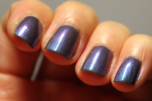
As I cannot read Japanese and I find their 'collections' very difficult to keep track of, I'm just going to be satisfied with saying that this is called Swan Lake. In my opinion, I think this would've made a way more epic official nail polish for the movie Black Swan than Zoya Bebe, which was more of a ballet leotard shade of light pink. I get the theme and all but come on, Black Swan was way not girly and feminine.

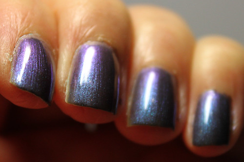
Swan Lake has a dark grey base, with some fine shimmer inside that really redefines my notion of 'duochrome'. It changes colour freakily. Though I would say the dominant shade is still a sort of dusty teal-blue, the purple hue it changes into at another angle is definitely not far behind. And when the light hits directly onto the nail, you really see this awesome bright teal colour, leaning almost towards green. And yet, all these awesome colours are muted and faded in its dark grey base, giving it a really ethereal feel.

I think I don't even need to explain why this polish would've made a better official polish for Black Swan. The now-you-see-it-now-you-don't shades of the polish, the soft, faded, dusty look and its graceful but possibly-sinister colours - everything spells out that movie.

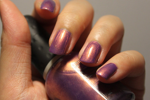
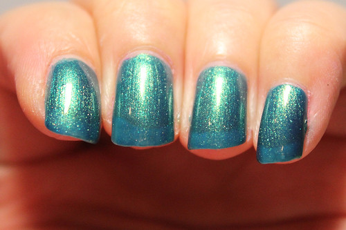
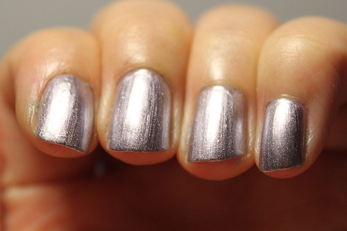
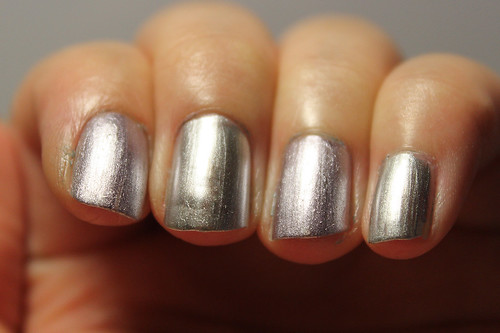
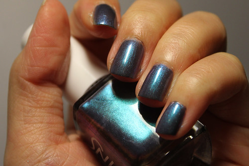
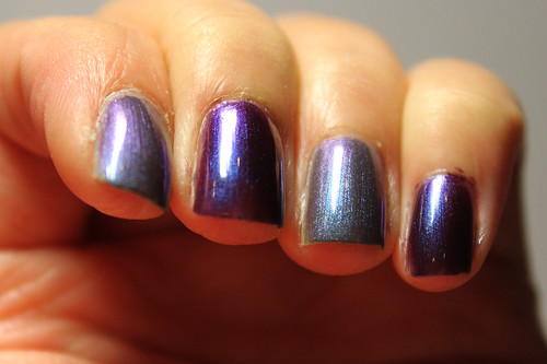
And here it is with flash:

Estessimo Tins Swan Lake with flash (1/2)

Estessimo Tins Swan Lake with flash (2/2)

Doesn't it look completely different from the ones taken in artificial light?!

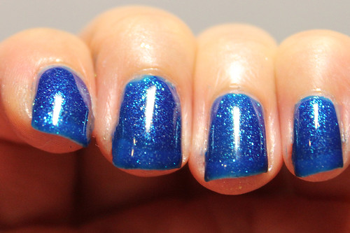
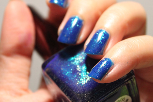
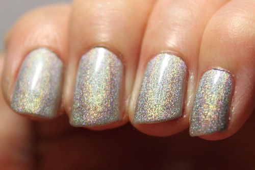
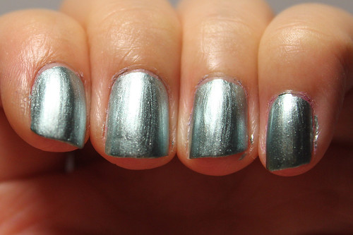
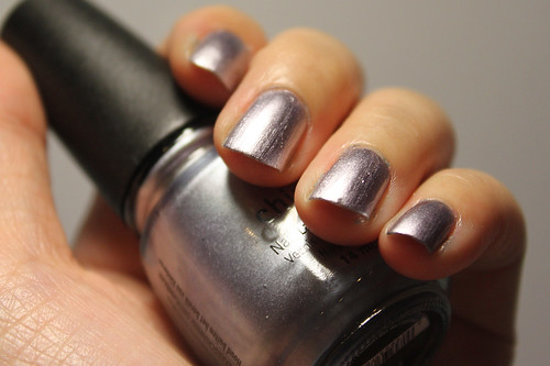
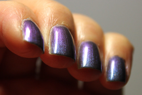
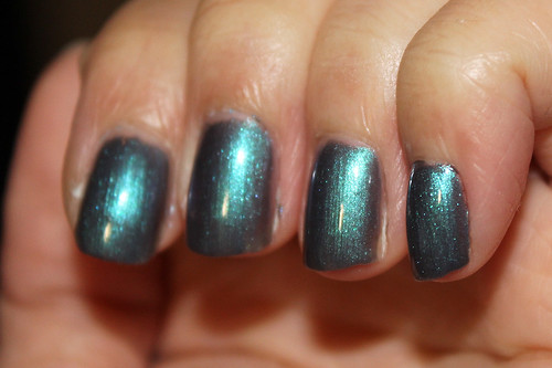
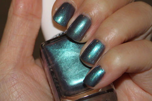
Anyway, it immediately reminded me of my other purple/blue duochrome, Orly Royal Velvet, so I pulled it out to compare...

Estessimo Tins Swan Lake vs Orly Royal Velvet (1/3)

Estessimo Tins Swan Lake vs Orly Royal Velvet (2/3)

Estessimo Tins Swan Lake vs Orly Royal Velvet (3/3)

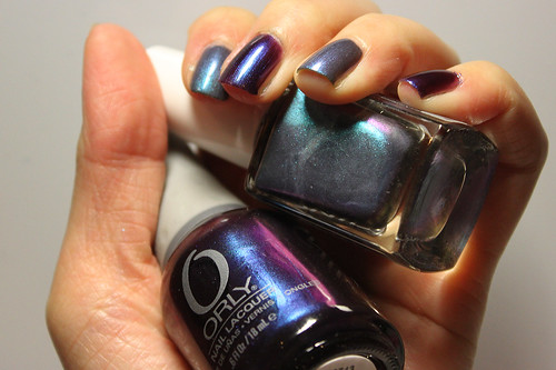
2 coats of Orly Royal Velvet.

Obviously, they are worlds apart. Next to RV, Swan Lake looks dusty, antique, faded, sun-washed - ghostly, even. Not to mention, Royal Velvet's predominant colour is a royal deep rich purple, where that of Swan Lake is the teal-blue flash that I spoke about earlier. The colour is so much richer in Royal Velvet because that royal purple is its base, whereas in Swan Lake, the base is a dark grey as mentioned, and that really desaturates the colour a lot, but it suits the soft and ghostly feel of the polish, to me.

Another thing I have to point out is that while normally I would call Royal Velvet a duochrome, it looks nothing like it next to Swan Lake. Swan Lake's duochrome is so crazy that you can see both purple and blue at the same time, sometimes, and it almost makes you a little dizzy looking at it. I actually suspect that it's because your left eye sees blue and the right eye sees purple. What?! That is seriously crazy.

This is my very first Estessimo Tins polish. I bought it from Tammy's nail blog, and it cost S$15. The formula was good, although a little on the thin side since I required 3 coats to build it up, but no major problems.

Friday, June 10, 2011

property of the half-blood prince.

seriously evil wizards (1/3)

I can never run out of Harry Potter quotes.

This is a Slytherin-inspired manicure dedicated to my friend, Lynette, on her birthday! She first suggested the idea of painting her nails red and gold for the occasion, and then I said, "Trying to be Gryffindor?" and then I came up with the idea of painting mine green and silver to match hers. I'm the Slytherin to your Gryffindor, babeh!

Anyway, I honestly couldn't be bothered to wait for 5 coats of Untamed Luxury so I simply painted 1 coat of China Glaze Millenium which dries so happily fast, and then painted another coat of Color Club Untamed Luxury over it. The green-teal jelly base of Untamed Luxury was very well brightened by the reflectiveness of the CG Millenium. I actually quite like the effect of it. It's definitely properly green, and without the hassle of having to paint ten million coats, especially since both Untamed Luxury and Millenium dry pretty fast (if only one coat).

seriously evil wizards (2/3)

seriously evil wizards (3/3)

Sorry if the scotchtape lines aren't as clean-cut as they ought to be, this is only my second time trying it out. I'm generally pleased with the effect, though I can already think of ways to improve my technique the next time I try it out. I'm starting to really like scotachtaping. It's less of a hassle than Konad and if you play around with it and get creative, you can come up with some really awesome nail art. I want to dry a sort of star burst kind of thing soon!

Anyhow, I hope Lynette likes it. :D I love the idea of having a matching manicure, and well, it gratifies the Harry Potter obsession in me too.