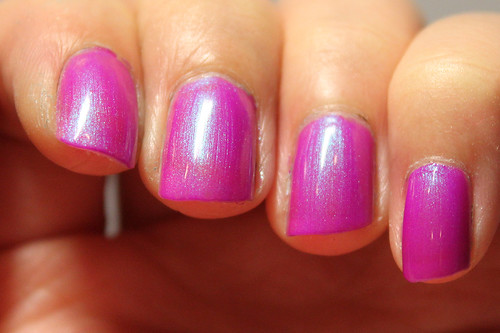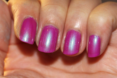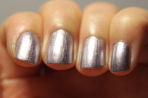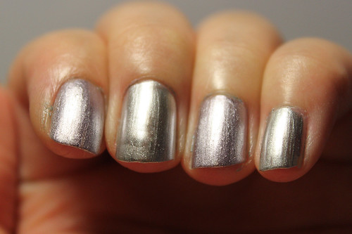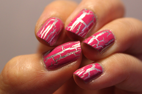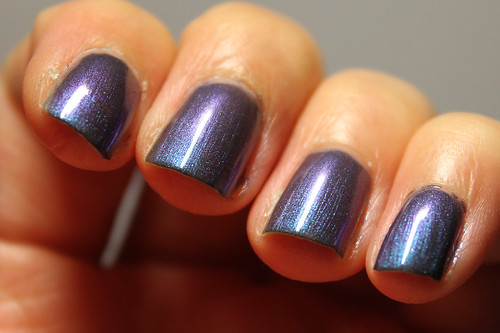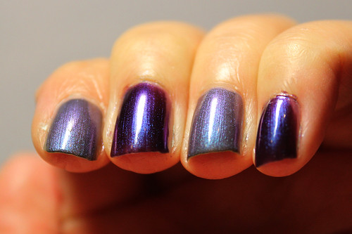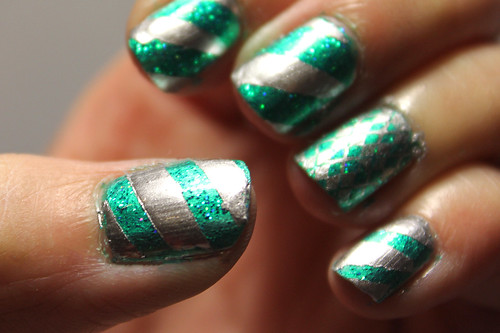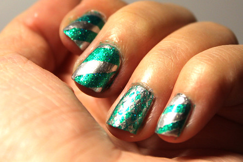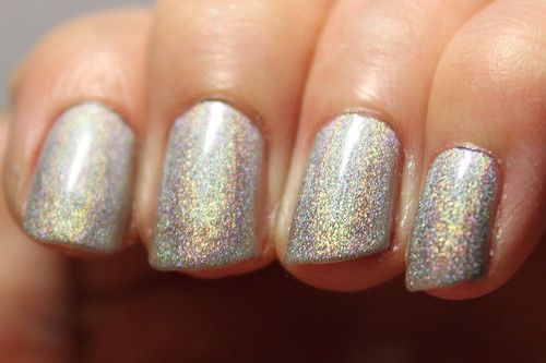
With flash
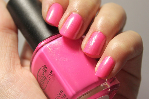
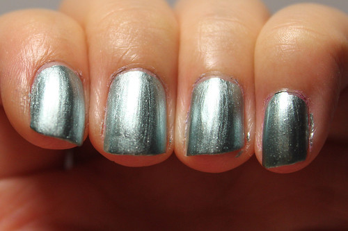
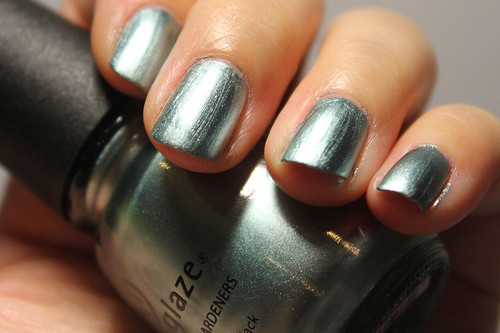
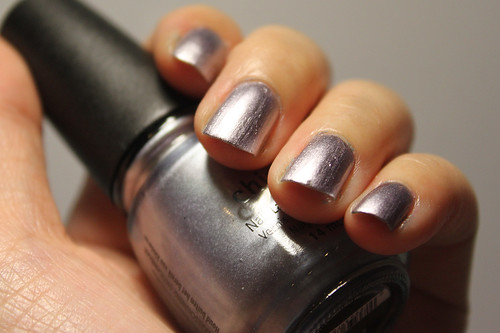
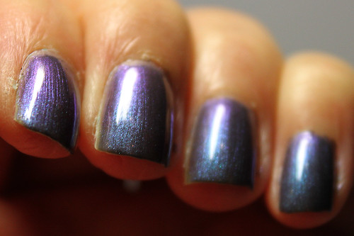
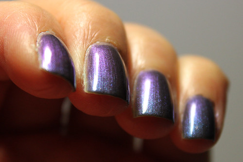
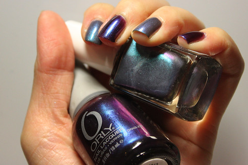
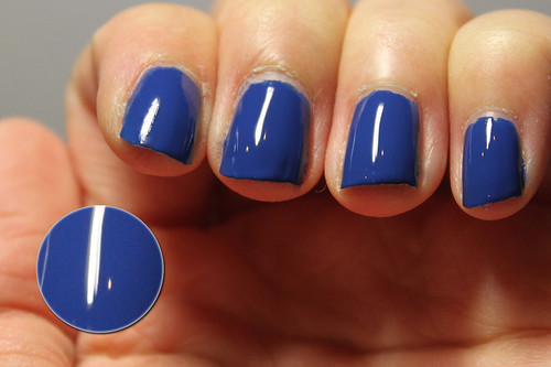
From the Femme Fatale collection 2009.
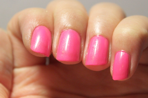
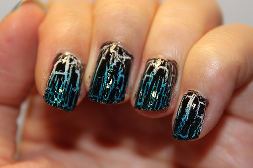
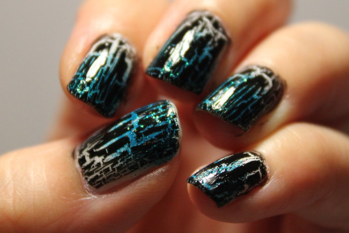
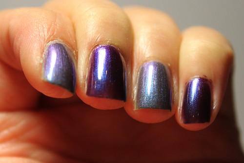
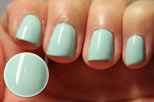
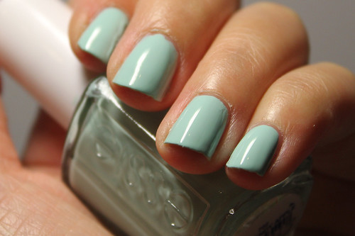
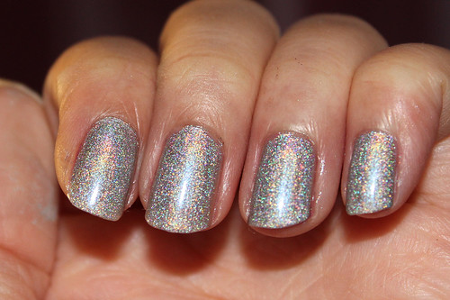
This was 3 coats, without topcoat.
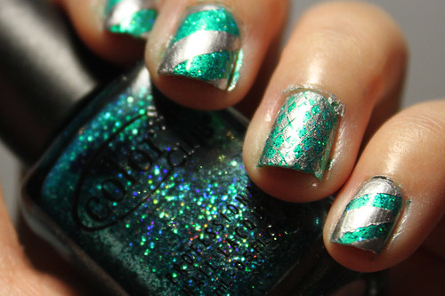
This is proof that not all valid holos need an Aqua Base, or has to be linear, or from the China Glaze OMG collection. I was initially hesitant. I wondered if Color Club, one of the secondary brands to my mind, can produce a decent holo. This polish threw my groundless doubts away and stomped all over them before burning. This is an amazing holo, so much so that it almost looks like a nail foil! Doesn't it look like I just stamped a piece of foil on my nail?
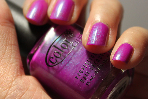
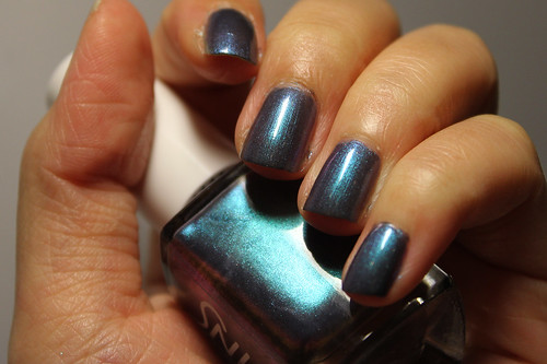
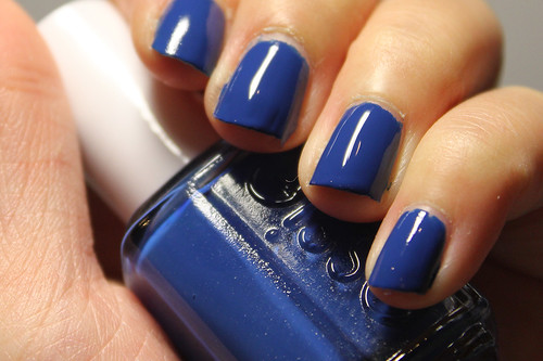
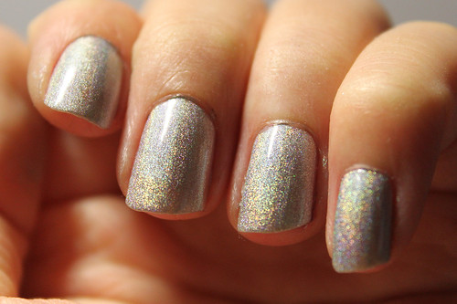
It is a scattered holo that is definitely silver, unlike OPI DS Sapphire. I have heard that though it required 3 coats to reach opacity on the nail, it does an excellent job as a stamping polish on Konad so I'm definitely going to have to try that soon. A holo stamp! That is immeasurable prettiness. The photo with the flash reminds me of those Pokemon trading cards I used to collect as a kid, with its holo borders. I love how fuzzy it is. I am beginning to appreciate scattered holos as much as I do linear holos.
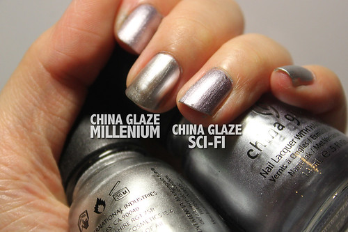
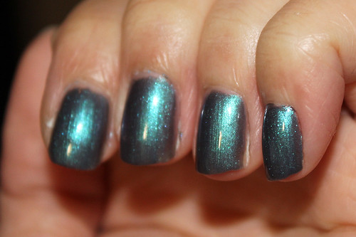
I also bought Color Club Revvvolution (I always can't keep track of how many 'v's there should be in its name), which is sort of its black holo counterpart, and I am eager to swatch it for you! I think I shall try out a Konad with Revvvolution as the base and Worth The Risque as its stamp.
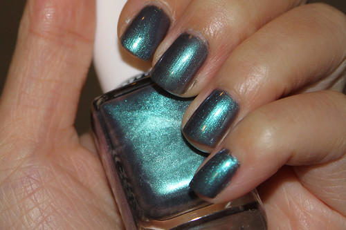
As a side note, my friend bought Color Club Fashion Addict, from the same collection and is a lavender scattered holo. It looks remarkably similar to my OPI DS Diamond! Perhaps I might get her permission to use it in a comparison between the two. If they are dupes, then Fashion Addict would prove to be a cheaper alternative to the slightly more expensive Designer Series by OPI.